MapD Immerse Chart Types
MapD Immerse lets you visualize your data in the format that provides the clearest insight. Charts range from basic to complex, from aggregate to detail level. You can combine your charts together into dashboards to explore every dimension and level of your data.
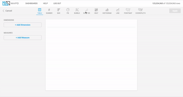
Table Chart
What it is
A Table chart is a non-graphical output of data, either at the row level from the database, or with a grouping or aggregation. You can sort any grouped data to view the top or bottom records for a measure.
When to use it
Use Table charts to view raw information from the database at the most detailed level. For example, if your dashboard includes an aggregated chart such as a Bar chart, which presents an aggregated measure broken out by a particular dimension, a Table chart can be a useful supplementary chart to show every record underlying the aggregation. If you have a Bar chart of cars sold per town in the United States, you can have a table chart showing details on each automotive transaction. Clicking a dimension in the Bar chart shows the detailed records for that dimension in the Table chart.
In addition to presenting row-level, non-grouped information from the database, you can also use Table charts to group information by a dimension, similar to most other chart types. Since other chart types have a limit on the number of measures that can be aggregated (Bubble chart has the most, at 4), you can use Table charts to view even more aggregated measures, since there is no restriction on the number of columns you can view.
How to set it up
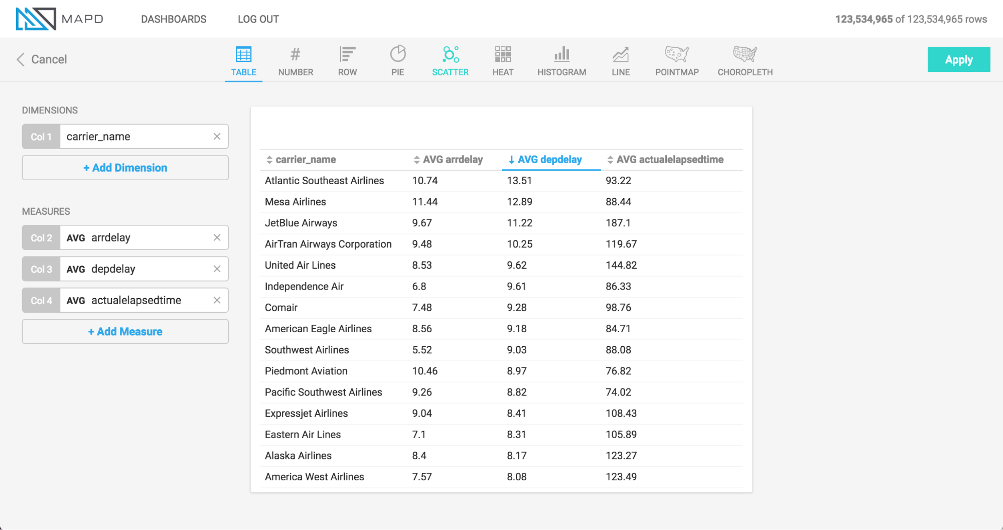
The animation uses an airline flights dataset to show the setup of a table chart with 4 measure columns (arrival delay, departure delay, flight time, and destination city), and then the grouping of those columns by a Dimension (airline carrier name).
Note that before the carrier_name dimension is added to group the information, the information is displayed at the row level from the database, meaning each record corresponds with a row in the database table. Using this non-aggregated view is a unique and useful capability of the Table chart.
Number Chart
What it is
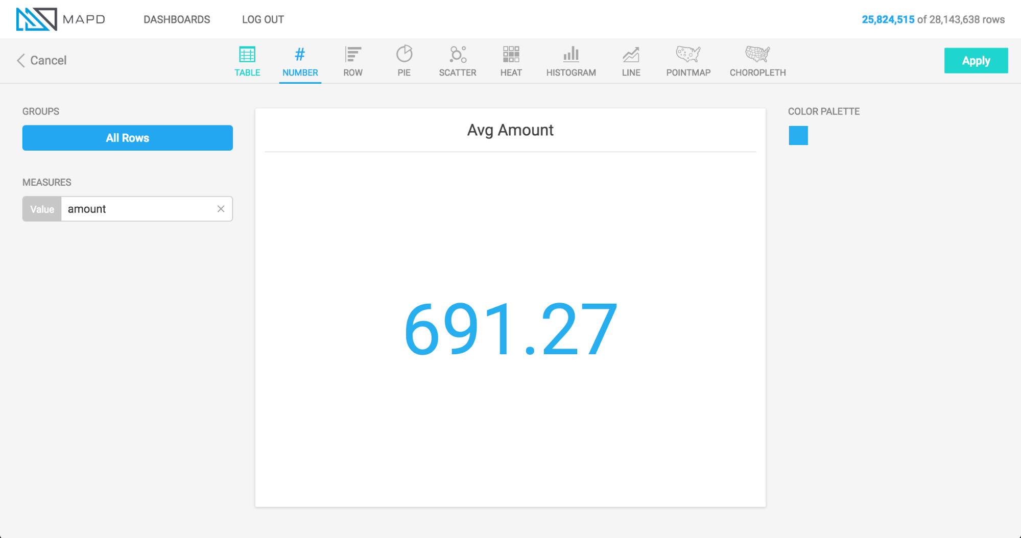
The Number Chart is a single aggregate value with no dimensions. For
example, in the image above, the value is the average of an entire column
named Amount. You can aggregate Number charts by Avg, Min,
Max, Sum, Count Unique (for string or smallint data
types), or Custom (where you can apply any SQL compatible custom
function; see Custom Measures).
When to use it
Use a number chart when you want a compact display of one
metric and are not interested in breaking out that metric by time,
category, or some other dimension. You can add multiple number charts
to a dashboard to concurrently view several aggregate calculations. For
example, viewing the Max, Min, Avg, and Sum of a
column all at once.
How to set it up
Since the Number Chart has no dimension, specify the column to be aggregated, and choose the aggregation type.
Bar Chart
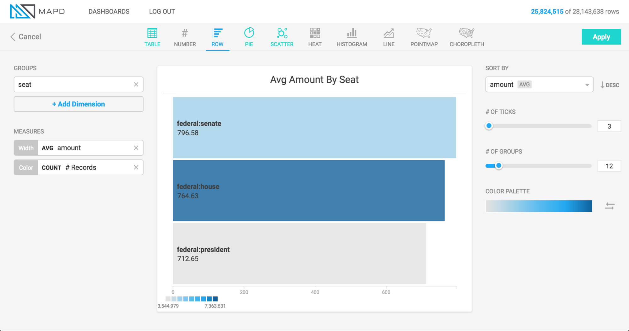
What it is
The Bar chart allows you to visualize a measure based on the width of the bar, broken out by one or more dimensions. In addition to using the width of the bar for one measure, you can add color visualize a second measure at the same time.
When to use it
Visualizing “population by state” is a classic bar chart scenario, breaking out a measure (Population) by a dimension (State). Add a color measure to concurrently visualize another measure (for example, population and per capita income by state). Note that you can also use Bar charts to visualize more than one dimension (for example, population by state by gender). In this case, the bar displays with a label showing each dimension, separated by a forward slash (for example, California / Female).
How to set it up
The animation below shows a bar chart being created for a political donations dataset, with the width of the bar corresponding to the average amount donated, the color of the bar corresponding with the number of donations, and the dimension breaking out the data by political office and by party.
Pie Chart
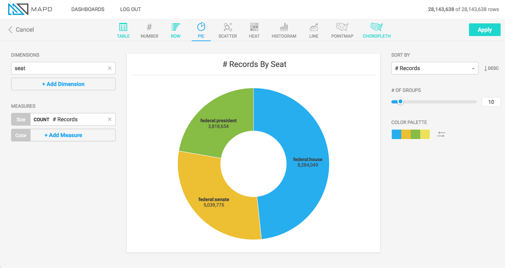
What it is
The Pie chart represents the proportional size of one group to another by representing them as segments of a circle. It can be useful for comparing a small number of categories.
When to use it
Use a Pie chart to show the relative proportion of a small number categories to one another. Avoid using pie charts when the number of categories is large, since slices become small and difficult to discern. Also avoid Pie charts when the values are very similar, as it is difficult to make a comparison.
How to set it up
The animation below shows a pie chart being created for a political donations dataset. The dimension breaks out the data by political office, the size of the segments corresponds to the total amount raised, and the color of the segments represents the average donation amount.
This animation shows colors being set based on a numeric measure, but you can manually set the colors of categories arbitrarily.
Bubble Chart
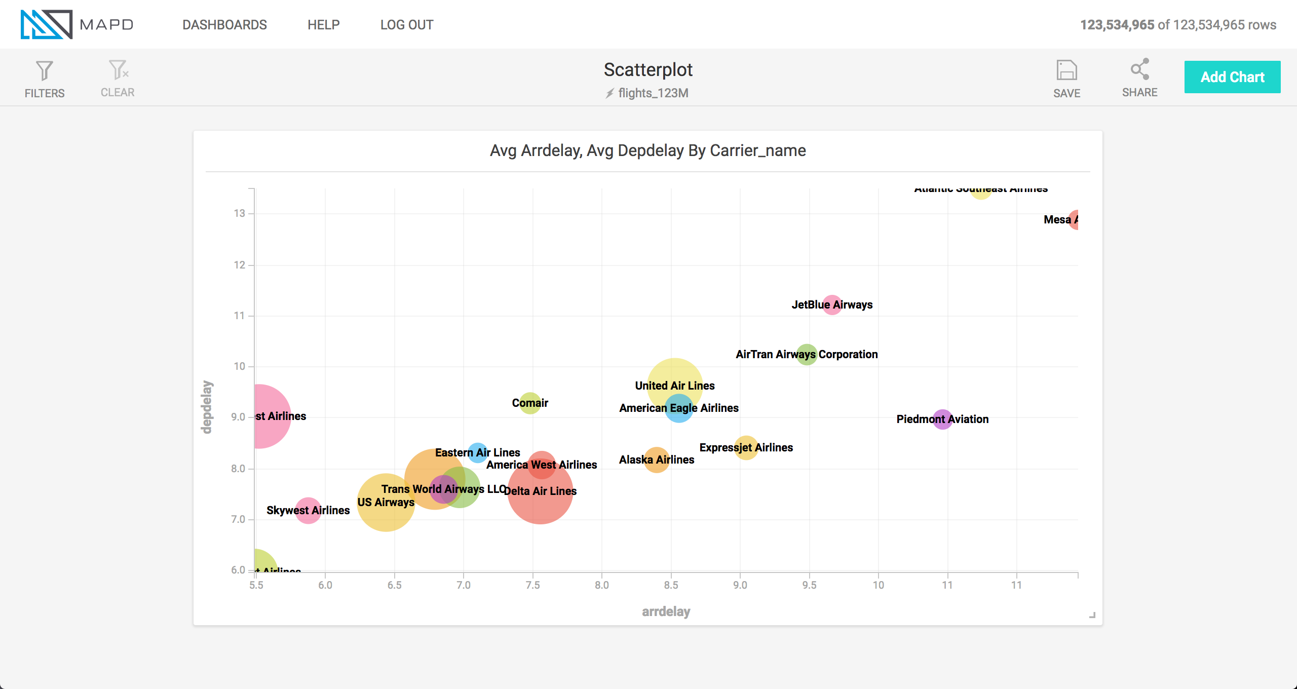
What it is
The Bubble chart groups data into dots and places those dots on an x and y axis. Each axis represents a measure. You can size or color the dots by further measures, making the bubble chart capable of representing up to four measures for each group (x, y, size, and color).
When to use it
A Bubble chart can be useful in a few different situations, including: 1) a dataset where you expect there might be a correlation between the x measure and the y measure; 2) a dataset where a correlation is not necessarily expected, but you want to understand the distribution and influence of multiple factors, or to spot outliers.
For example, you can use a Bubble chart to examine automotive engine performance by plotting horsepower on the X axis and engine displacement on the Y axis. More displacement usually means more horsepower, so you would expect the dots to cluster along an angled line rising from left to right. To the extent that data deviates off of that imagined line, you might infer that engines falling above the line have unusually high efficiency.
How to set it up
The animation below shows a Bubble chart being created for an airline flights dataset, with the dots representing airlines, the x and y axes representing flight arrival delay and departure delay, size representing the number of flights, and color representing the average length of flight.
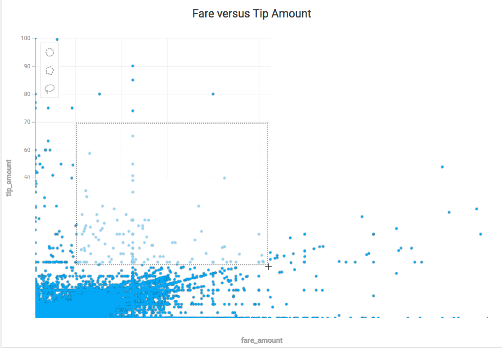
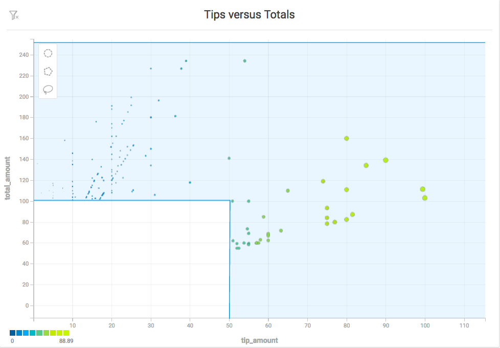
Scatter Plot
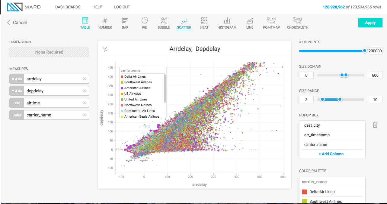
What it is
The Scatter plot displays unaggregated, row-level data as points, plotting the points along an x and y axis. Each axis represents a quantitative measure. You can size or color points by further measures, making the scatter plot capable of representing up to four measures for each group (x, y, size, and color). Scatter plots resemble Bubble charts, but are used to view unaggregated data while Bubble charts aggregate data.
When to use it
Similar to Bubble chart, use a Scatter plot when you want to study the correlation between two measures, or simply visualize the distribution of data to spot outliers or patterns. Scatter plots can be used to visualize any sized dataset, but they really shine in their ability to visualize large amounts of data.
How to set it up
The animation below shows a scatter plot being created for an airline flights dataset, with each point representing a flight, the x and y axes representing flight arrival delay and departure delay, size representing the flight duration, and color representing the airline carrier.
On the right hand side of the screen, a popup box is configured, which displays columns of information whenever one of the points on the map is moused over.
Note also that once the Size measure is added on the left of the screen, controls become available on the right of the screen for “Domain” and “Range.” Domain is used to establish limits on the data that is considered for sizing, Range is used to set the range of sizes (in pixels) for the points. Domain and Range controls function in the same way in the Pointmap chart type, and a more detailed explanation of these controls’ use can be found in section Size Domain.
Zoom and Selection
You can zoom in on specific areas of a Scatter plot chart and select arbitrary sets of data points using the selection tools.
Zoom
You can select and zoom a specific region of a Scatter plot chart. Hold the shift key, then drag a rectangular selection around the area on which you want to zoom. You can also zoom in and out using a mouse scrolling button.
Selection
You can select a subset of the points in a Scatter plot using the Circle, Polygon, and Lasso selection tools.
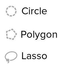
Circle Selector
Use the Circle tool to select an area around a specific central point. Click the Circle tool icon, then click anywhere on the map to create a circular selection.
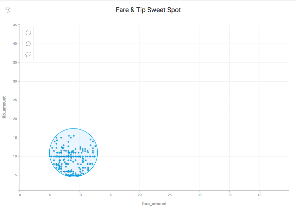
To move the circle, click anywhere inside the selected area to select the circle. Drag the circle to the new location.
To resize the circle, click anywhere inside the selected area, then drag any of the white squares to scale the circle up or down. Drag the white squares at the midpoints to scale in only one direction. Hold the Shift key to maintain the relative proportions of the selection. Hold the Alt key to scale the selection from the center outward.
Polygon Selector
Use the Polygon tool to select an area with noncomplex angles. Click to set each point. As you draw the selection, you can hold the Shift key to contrain each line to 45° angle increments relative to the previous line.
To complete the selection, do one of the following:
- Double-click
- Click the starting point a second time
- Press Enter
To change the size of the selection, click anywhere in the selected region. Drag any of the white corner dots to resize the selection. Hold the Shift key to constrain the relative proportions of the selection. Hold the Alt key to scale the selection from the center.
To rotate the selection, mouse hover over any corner to display a curved arrow. Click and drag to rotate. Hold the Shift key to rotate in 45° increments.
To edit the endpoints in the selection, double-click anywhere in the region. Drag the white endpoints to new locations. To add an endpoint, click one of the small orange dots in the middle of a line segment; it becomes a new endpoint that you can drag to your desired position. To delete an endpoint, hold the Alt key and click the endpoint.
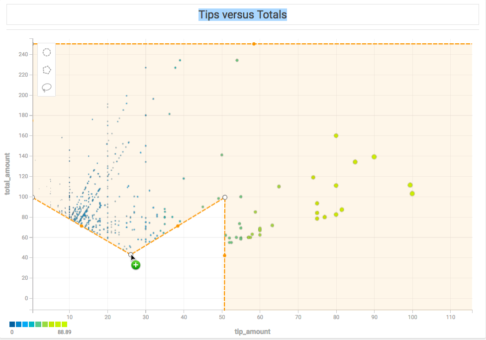
Note that if you create a selection where lines intersect the behavior is undefined and has unpredictable results.
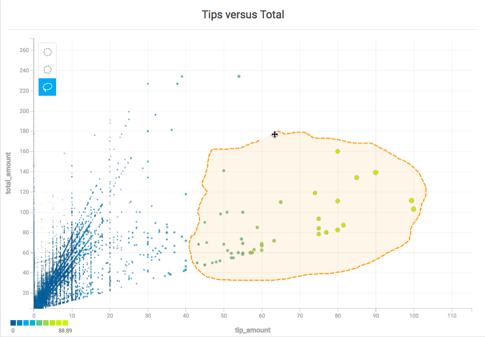
Lasso Selector
Use the Lasso tool to trace around an area with curves or complex angles. Click to start, drag to draw the outline of your desired area, then release the mouse at any time to complete the selection with a straight line.
Once you have created your selection, the selection points are simplified, and you can edit or update the selection as you would a selection made with the Polygon tool.
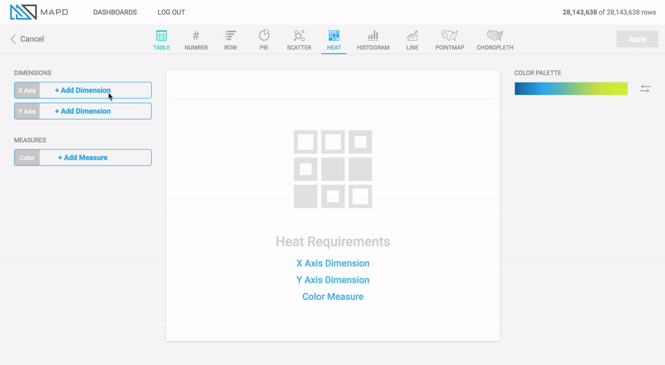
Heatmap
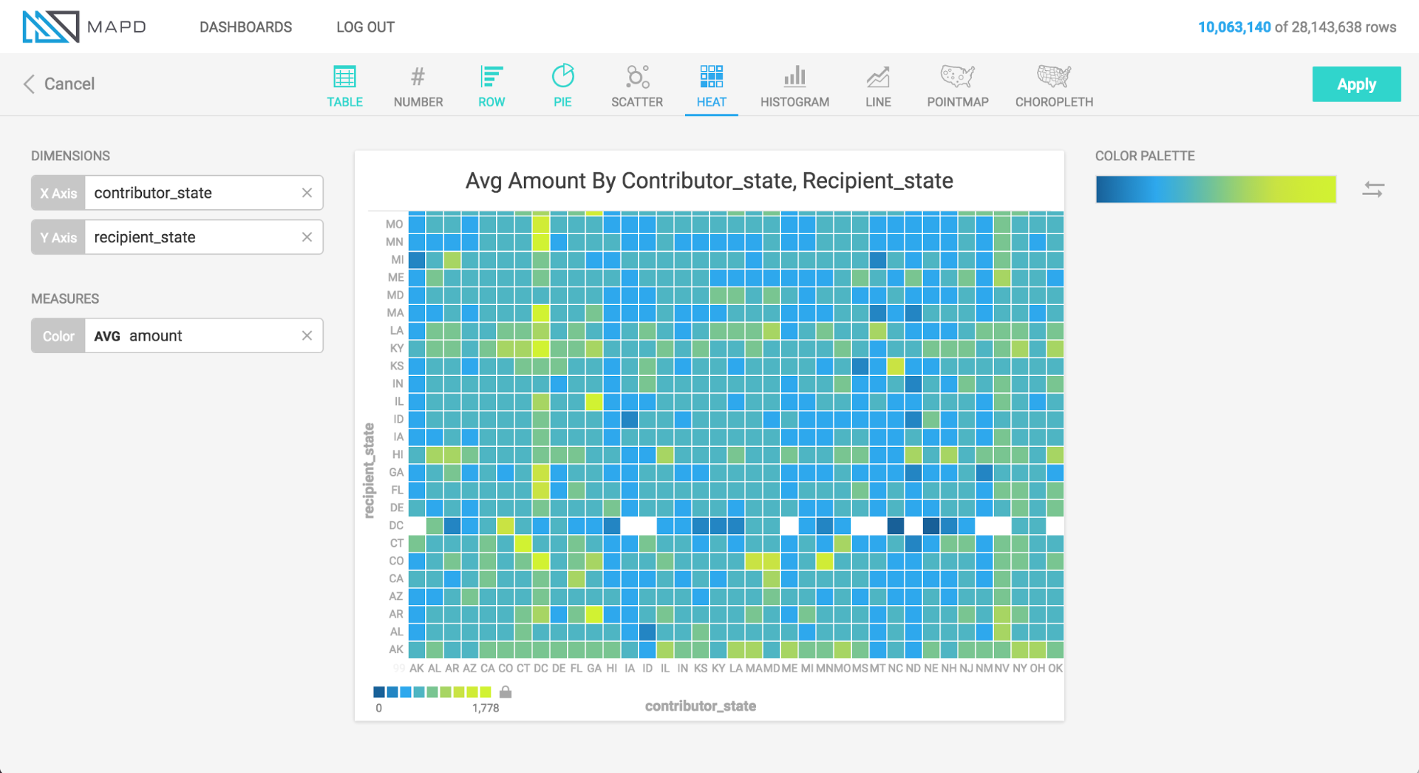
What it is
The Heatmap displays information in a two-dimensional grid of cells, with each cell representing a grouping of data. Color indicates the relative value cells, shifting from one end of a spectrum for lower values, to the other end of a spectrum for higher values.
When to use it
Use a Heatmap to compare the relative values of groups. Heatmaps are ideal for spotting outliers, which show up vividly on the color spectrum. They work best when the number of groupings is not too large, since large numbers of groupings cause the heatmap to exceed the viewport, making comparison harder (for such scenarios, consider using a scatterplot).
How to set it up
The animation below uses a political contributions dataset to create a histogram of average donation amount, broken out by contributor state and recipient state. During setup of the chart, the minimum and maximum of the color scale are tuned to give a clearer visualization.
Histogram
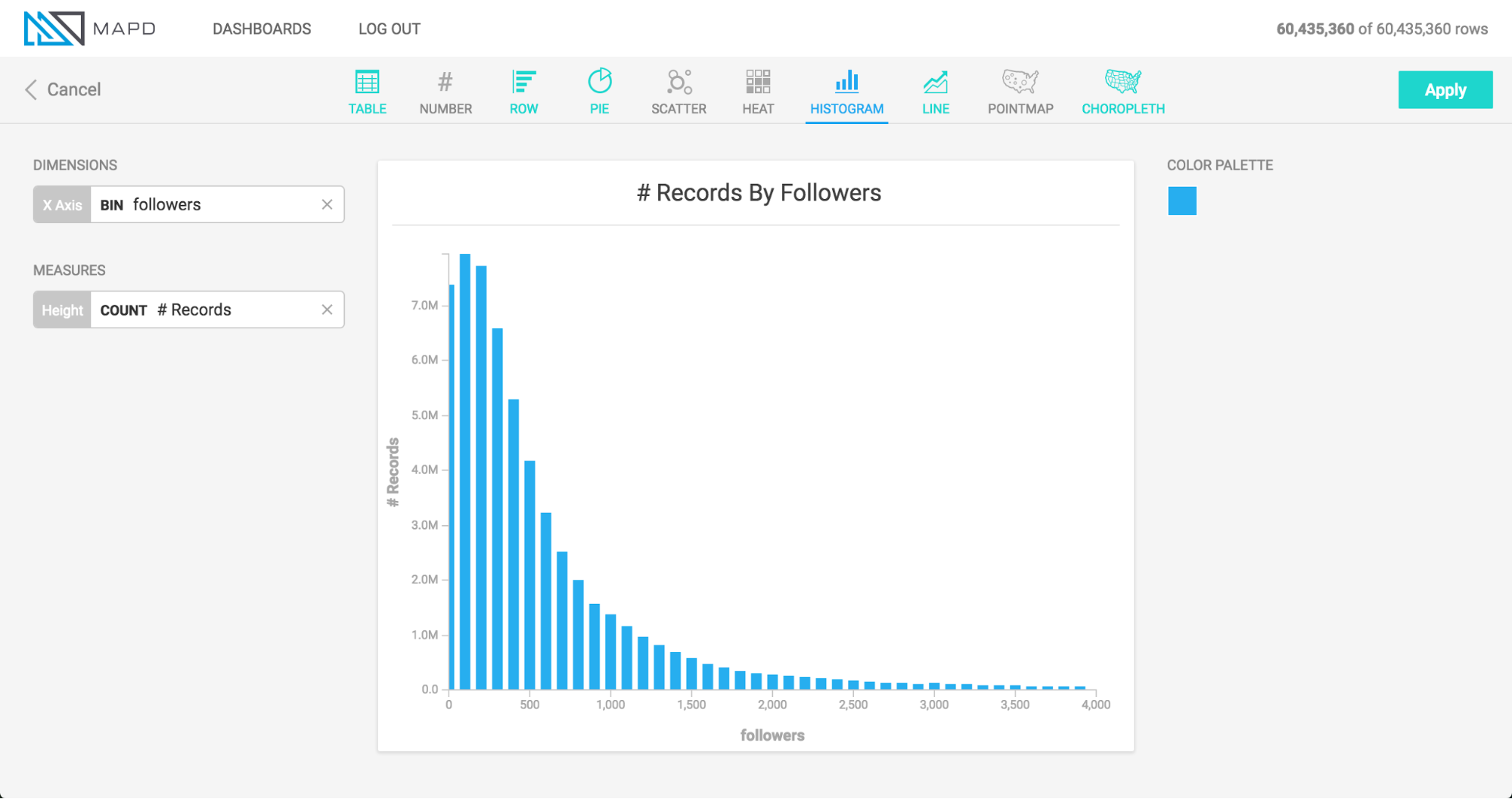
What it is
The Histogram displays the distribution of data across a continuous variable, by aggregating the data into bins of a fixed size. Vertical bars are used to show the count of data within each bin, with taller bars indicating areas of density within the dataset. In MapD Immerse, You can use Histograms to count occurrences of data other than the binned dimension (shown in “How to set it up” below).
When to use it
Use a Histogram to understand the distribution of your data, and to see
areas of unusually high or low density, which would be masked by a simple
aggregate such as Average.
How to set it up
The animation below uses Twitter data to set up two histograms.
The first histogram in the animation shows the distribution of data for number of followers, indicating that a large number of people have fewer than 150 followers, followed by a diminishing “long tail” of people with more than that number.
The second histogram shown below forms bins based on one column (followers), but draws the vertical height of the bars based on count of a different column (the number of followees ). This allows us to see how the count of one column varies when viewed by groupings of another column. In this case, people with more followers also tend to follow more accounts themselves, up to the level of about 20,000 followers, at which point the relationship becomes more tenuous.
Line Chart
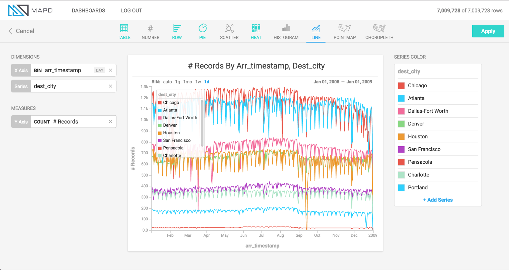
What it is
The Line chart represents a series of data as a line or multiple lines, plotted across time or another numerical dimension.
When to use it
Use a Line chart when you want to view how a measure changes over the course of time, or across the range of some other dimension. The optional multi-series capability of the Line chart is can break out values by an additional dimension; for example, as shown above, to compare the number of daily flights to several cities over time.
How to set it up
The animation below uses a political contributions dataset to create a histogram of average donation amount, broken out by contributor state and recipient state. During setup of the chart, the minimum and maximum of the color scale are tuned to give a clearer visualization.
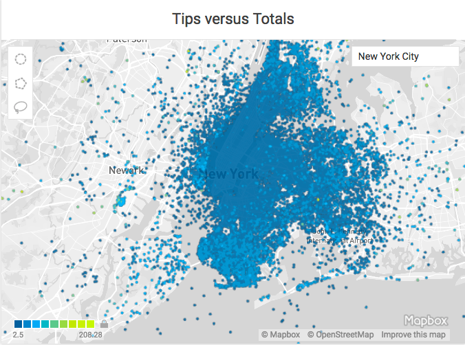
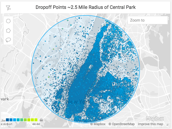
Point Map
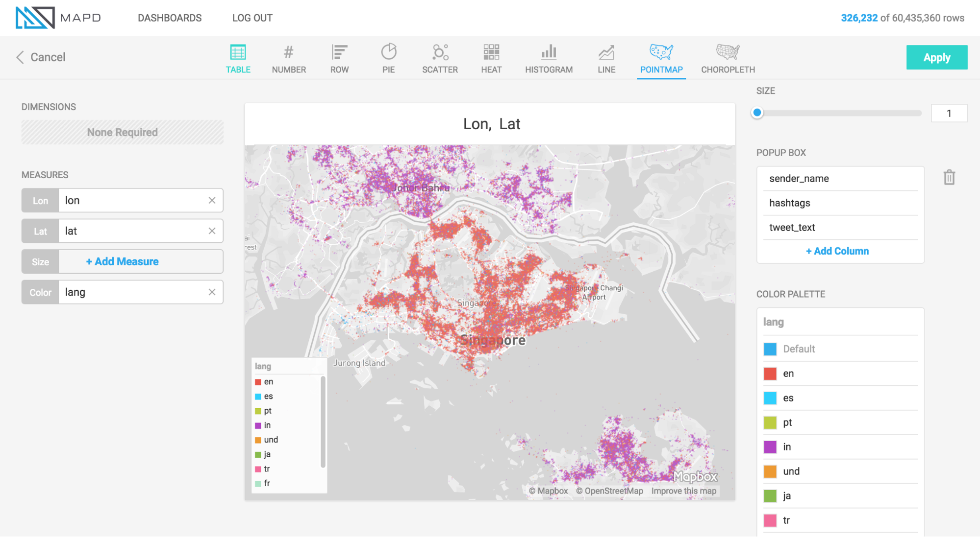
What it is
The Point map plots geographic latitude/longitude data to visualize the location of data on a map. In addition to location, points on the map can be sized and colored to represent measures of data. Hovering over a point can reveal a popup box with further details on that point.
When to use it
Use a Point map when you want to view a detailed, granular display of geographic information, and your data is at the latitude/longitude level of detail. The Point map does not aggregate data, but presents it as individual, lat/long rows from the database table (if you need aggregation of geographic data, use the Choropleth chart).
How to set it up
The animation below shows the selection of Longitude and Latitude measures to plot the location of points, and the selection of color and size measures, to add additional detail. The animation also shows the adjustment of settings for “Size Domain” and “Size Range,” which are used to adjust how points are sized.
Size Domain
The Size Domain setting lets you set minimum and maximum bounds for the Size Measure you choose. For example, in the animation below, which uses U.S. political contributions data, the Size Measure chosen at the left side of the screen is Amount, which has values from -5m to over 25m. The majority of political donations are not millions of dollars, and are not negative, so by adjusting Size Domain we can make sure the sizing of the dots on the pointmap is determined by a more realistic minimum/maximum bounds ($0 - $5,000 is used here).
Note that setting minimum/maximum bounds using Size Domain does not exclude values outside of those bounds from the dataset — they do still appear on the map. Rather, the Size Domain sets the minimum value, which is used to size the smallest point, and maximum value, which is used to size the largest point. For example, if you set the maximum for Size Domain to $5,000, any point greater than $5,000 is the same size as one which is $5,000.
The practical effect of Size Domain is to control the impact of outliers, and create a more informative map for the range of values that are most pertinent to your analysis.
Size Range
Size Range represents sizes of the smallest and largest points on the screen, measured in pixels. Points can range in size from 1 to 20 pixels. Note that if you set very large pixel values for the top of the range (for example, 20), the largest points might cover many smaller points that fall underneath them. Accordingly, setting size ranges is a balance between making it easy to spot the largest values with very large points, and comprehensiveness of the data that you can see (using smaller point ranges allows more points to be seen on the map).
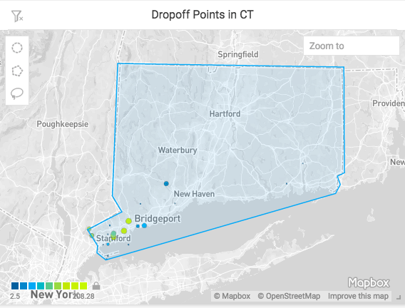
Zoom and Select
Point map charts have additional features for zooming in and selecting details.
Zoom
You can select and zoom a specific region of a Point map. Hold the shift key, then drag a rectangular selection around the area on which you want to zoom. You can also zoom in and out using a mouse scrolling button.
The Zoom To box in the upper right corner of the map lets you enter a geographic location. You can enter the name of a country, a city, or even your home address, and the map will fly there for you.
Selection
You can select geographic regions based on proximity or defined boundaries using the Circle, Polygon, and Lasso selection tools.
Circle Selector
Use the Circle tool to select an area around a specific central point. Click the Circle tool icon, then click anywhere on the map to create a circular selection.
To move the circle, click anywhere inside the selected area to select the circle. Drag the circle to the new location.
To resize the circle, click anywhere inside the selected area, then drag any of the white squares to scale the circle up or down.
Due to the distortion inherent in Mercator map projections, the circumference of the selection is reduced as you get closer to the equator, and increased as you approach the poles. In the example below, all of the areas are the same number of meters in diameter, with the size of the selection circle adjusted to allow for Mercator distortion.
Polygon Selector
Use the Polygon tool to select an area with noncomplex angles. Click to set each point. As you draw the selection, you can hold the Shift key to contrain each line to 45° angle increments relative to the previous line.
To complete the selection, do one of the following:
- Double-click
- Click the starting point a second time
- Press Enter
To change the size of the selection, click anywhere in the selected region. Drag any of the white corner dots to resize the selection. Hold the Shift key to constrain the relative proportions of the selection. Hold the Alt key to scale the selection from the center.
To rotate the selection, mouse hover over any corner to display a curved arrow. Click and drag to rotate. Hold the Shift key to rotate in 45° increments.
To edit the endpoints in the selection, double-click anywhere in the region. Drag the white endpoints to new locations. To add an endpoint, click one of the small orange dots in the middle of a line segment; it becomes a new endpoint that you can drag to your desired position. To delete an endpoint, hold the Alt key and click the endpoint.
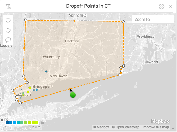
Note that if you create a selection where lines intersect the behavior is undefined and has unpredictable results.
Lasso Selector
Use the Lasso tool to trace around an area with curves or complex angles. Click to start, drag to draw the outline of your desired area, then release the mouse at any time to complete the selection with a straight line.
Once you have created your selection, the selection points are simplified, and the selection becomes effectively the same as a selection made with the Polygon tool.
Choropleth
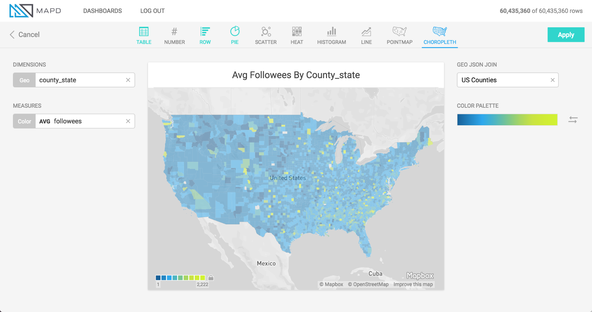
What it is
The Choropleth, from the Greek choros (area) and pleth (value), compares numerical information across regions by coloring regions based on the relative size of a numerical measure. The map displays low intensity to high intensity color, allowing comparison of values of one region to another.
When to use it
Use a Choropleth to compare the average value (or another aggregate value such as SUM or COUNT) across multiple regions. Choropleths are useful for spotting outlier regions, but are not intended to provide great detail on the values within a particular region, since they present aggregate-level information only. (For detailed, point-level geographic information, consider using a Point map.)
How to set it up
The animation below shows the selection of a Dimension of a column containing names of US Counties, the selection of Geojson (region shapes) matching that region type, and the selection of a measure. Chart title is then shown to be edited to a more informative title.
In addition to US counties Geojson, the user may also select Countries or US States.
Geojson is a file format that contains the shapes that are rendered on the map. To match the geojson shapes onto the Geo Dimension you select, the region names must match one another.