Common Chart Elements
This topic provides an overview of common elements for creating any type of chart. The specifics for creating each chart type are discussed in Immerse Chart Types.
Dimensions
Dimensions are the grouped columns in a query. For example, if a table lists every car sold in the United States, and you want to display the number of cars sold per manufacturer, the dimension is car manufacturer (that is, the query results are grouped by manufacturer).
A query can have more than one dimension. For example, the number of cars sold by car manufacturer, by state. When a chart has multiple dimensions, the dimensions are separated by forward slashes (/). For example, the car manufacturer by state would display “Chevrolet / California.” Table Charts display multiple dimensions in separate table columns. You can change the order of dimensions by dragging and dropping the dimensions.
Certain chart types have restrictions on the types of dimensions you can use. For example, histograms and line charts can only have numerical dimensions. Choropleths can only have dimensions that reflect geographic regions. Pointmaps have no dimensions, since they display geographic points at the latitude/longitude level only. Number charts have no dimensions, since their purpose is to present only a single number.
Binned dimensions
When a dimension is set to a numerical column, Immerse presents information grouped by each number. If there are many numbers, Immerse automatically creates binned ranges of numbers. For example, if you have a table with many distinct numbers from 1 to 1 million, a display of 10 bins would be 1 - 100,000, 100,001 - 200,000, and so on.
You can manually disable Immerse’s automatic binning to force the display of all numbers in the dimension. Depending on the expense of the query, Immerse might display a notification that the unbinned query is not available.
Measures
Typically, measures are calculated fields such as SUM, AVERAGE, etc. These calculated values are what Immerse plots to create charts. This allows you to visually compare measures of one dimension with another.
If you select a numerical column, as a measure, you can choose to aggregate that column as AVERAGE, MIN, MAX, or SUM. If you choose a string column (that is, a column of text values), Immerse automatically aggregates by COUNT UNIQUE, which returns the count of distinct strings in that column.
Depending on the chart, Immerse can visualize anywhere from one to four measures. A Pie chart, for example, offers 2 measures, Size and Color. Whichever column you choose as the size measure is used to determine the size of the slices in the pie chart. Color is an optional second measure for Pie Chart, allowing another layer of information to be visualized on the same chart. For example, you can size the Pie’s slices by the number of sales opportunities that are closed, and color them by the average income from those sales.
A more complex chart, such as a scatter plot, can concurrently visualize up to four measures. Scatter plots show values on a two-dimensional matrix, based on an X measure and a Y measure. Additionally, the dots used in the scatterplot can be sized and colored by two additional measures, for a total of four measures.
Special Behavior with Table Charts, for Measures
Table charts are a non-graphical, row/column presentation of raw data. Measures can behave different than with other chart types. If you create a table chart with measures but no dimensions, the data is not grouped; the chart presents raw information at the row level from the database. If you create a table chart with dimensions, the measures act in their usual way, as an aggregate calculation. If you want to view raw, row-level information from the database without performing any transformations or calculations, create a table chart with measures but no dimensions.
Custom Measures
In addition to normal measures, which perform simple aggregation calculations on data, you can create custom measures that perform arbitrary SQL aggregations for any MapD supported SQL. Consider the following standard SQL query:
SELECT column1, COUNT(column1) FROM table WHERE column1=’foo’ GROUP BY column1
The custom measure can be any aggregate statement that can be substituted for the term COUNT(column1) above.
For example, a valid custom measure could be a multiplication calculation highlighted below:
SELECT region, product, SUM(units\*price) FROM table …
Or you might transform the data using a CASE statement, to knock out values that do not meet a certain test, using the custom measure below:
SELECT column1, CASE WHEN SUM(column2)>10 THEN SUM(column2) ELSE 0 END FROM table GROUP BY column1
Since most Immerse charts require dimensions, which group the data, custom measures for those charts always need to be written as aggregate statements, as in the examples above. However, for charts that do not require dimensions, such as a point map or table, you can write custom measures that are not aggregate statements.
Chart Title
When you create a chart, Immerse automatically generates a title for the chart using the dimension and measure names. You can customize the title of the chart in the chart editing screen by clicking the chart title and typing your own.
Save Chart to Dashboard
After you create and configure your chart, click Apply to add the chart to your dashboard.
Changing Chart Type
You can change the chart type by toggling among the chart icons at the top of the chart editing screen. If you have already chosen dimensions and measures for a chart, Immerse indicates which other chart types are also capable of displaying that data by highlighting the chart icons in green.
Some charts require certain types of dimensions/measures and disallow others. As you switch between charts, you might see dimensions or measures become deactivated (grayed-out) if they are not appropriate for that chart type. Deactivated fields are discarded once you save a chart.
Chart Filters
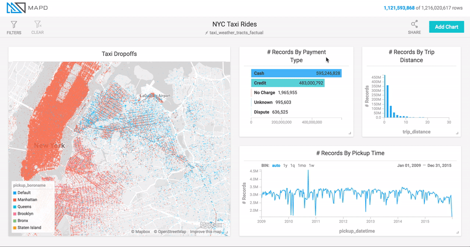
Immerse lets you narrow the data being considered by clicking on areas of the chart which you want to filter for. For Line and Histogram charts, filter by dragging left or right along the chart to select a range (brushing).
For point map and scatter plots, filter by zooming in on regions. Hold the shift key to select a rectangular area of the map and zoom in. You can also use the mouse wheel or trackpad to zoom in and out.
Point maps also provide a Zoom To field, where you can zoom to a particular geographic location by name. You can enter a country, a city, or something as specific as a street address.
For other charts, click the section of the chart on which you want to focus.
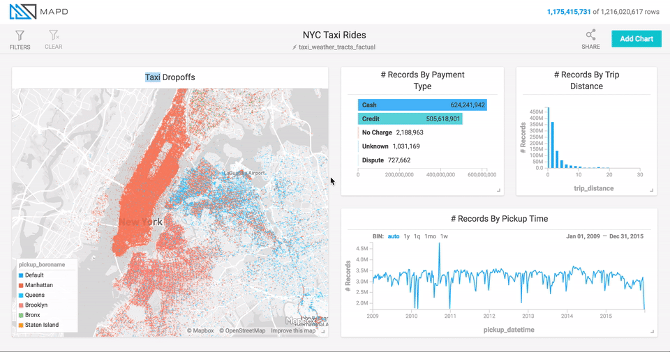
Inverse Filters
If rather than filtering for certain data, you want to filter out data, click the chart while holding down the Command key (Mac) or Control key (Windows/Linux). This feature is available for all chart types other than line, histogram, point map, and number.
Global Filters
Immerse allows you to filter data at the dashboard level, constraining
data for all charts on the dashboard. At the top of the dashboard
screen, click Filters / Add Filter, then select the column on which
you want to filter. Depending on the data type of the column, Immerse offers
appropriate ways of filtering for that type. For string columns for
example, you can search using options such as Contains or Equals.