Bar Chart
What it is
The Bar chart allows you to visualize a measure based on the width of the bar, broken out by one or more dimensions. In addition to using the width of the bar for one measure, you can add color visualize a second measure at the same time.
When to use it
Visualizing “population by state” is a classic bar chart scenario, breaking out a measure (Population) by a dimension (State). Add a color measure to concurrently visualize another measure (for example, population and per capita income by state). Note that you can also use Bar charts to visualize more than one dimension (for example, population by state by gender). In this case, the bar displays with a label showing each dimension, separated by a forward slash (for example, California / Female).
How to set it up
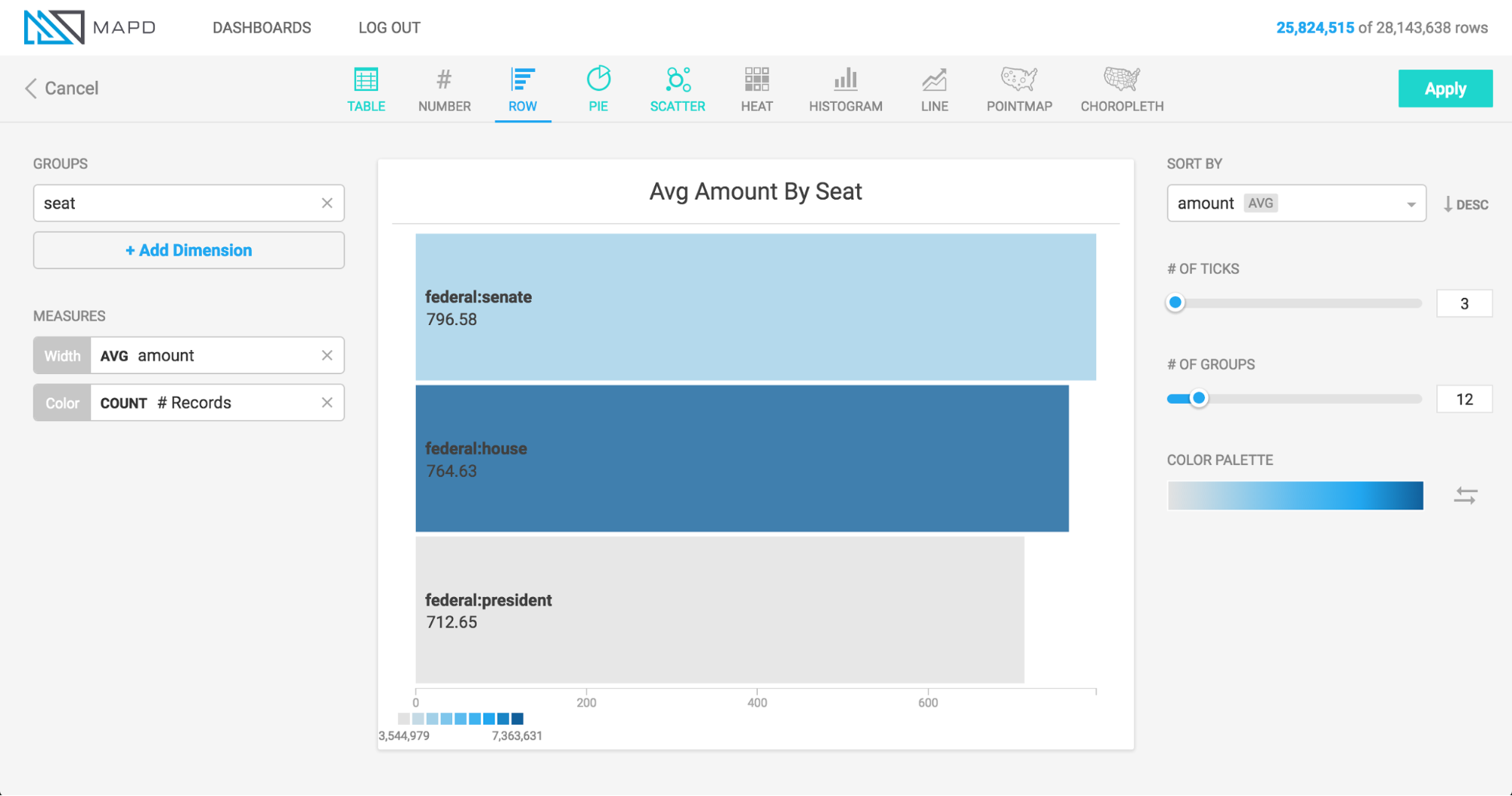
The animation below shows a bar chart being created for a political donations dataset, with the width of the bar corresponding to the average amount donated, the color of the bar corresponding with the number of donations, and the dimension breaking out the data by political office and by party.