Choropleth
What it is
The Choropleth, from the Greek choros (area) and pleth (value), compares numerical information across regions by coloring regions based on the relative size of a numerical measure. The map displays low intensity to high intensity color, allowing comparison of values of one region to another.
When to use it
Use a Choropleth to compare the average value (or another aggregate value such as SUM or COUNT) across multiple regions. Choropleths are useful for spotting outlier regions, but are not intended to provide great detail on the values within a particular region, since they present aggregate-level information only. (For detailed, point-level geographic information, consider using a Point map.)
How to set it up
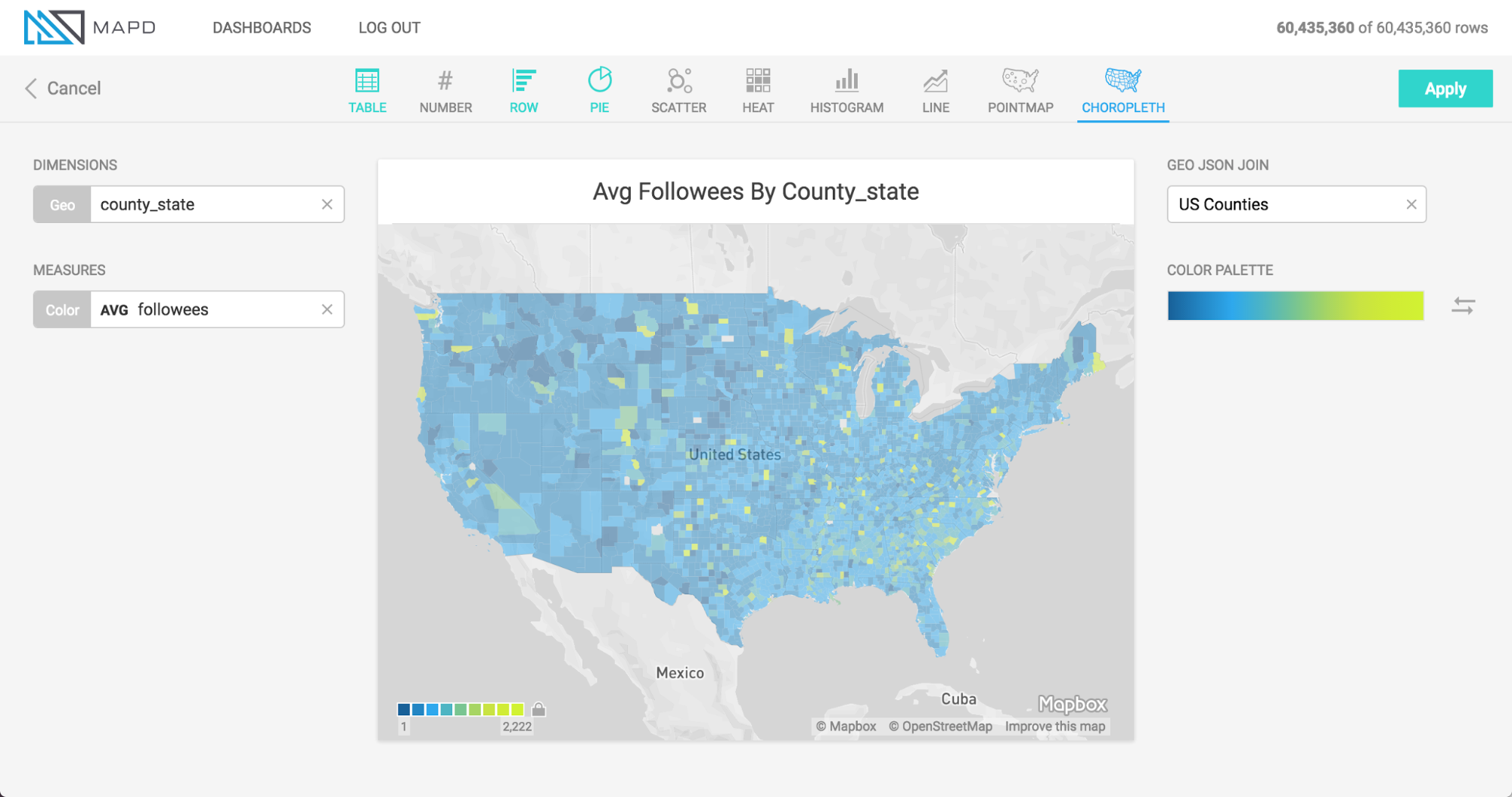
The animation below shows the selection of a Dimension of a column containing names of US Counties, the selection of Geojson (region shapes) matching that region type, and the selection of a measure. Chart title is then shown to be edited to a more informative title.
In addition to US counties Geojson, the user may also select Countries or US States.
Geojson is a file format that contains the shapes that are rendered on the map. To match the geojson shapes onto the Geo Dimension you select, the region names must match one another.