Pie Chart
What it is
The Pie chart represents the proportional size of one group to another by representing them as segments of a circle. It can be useful for comparing a small number of categories.
When to use it
Use a Pie chart to show the relative proportion of a small number categories to one another. Avoid using pie charts when the number of categories is large, since slices become small and difficult to discern. Also avoid Pie charts when the values are very similar, as it is difficult to make a comparison.
How to set it up
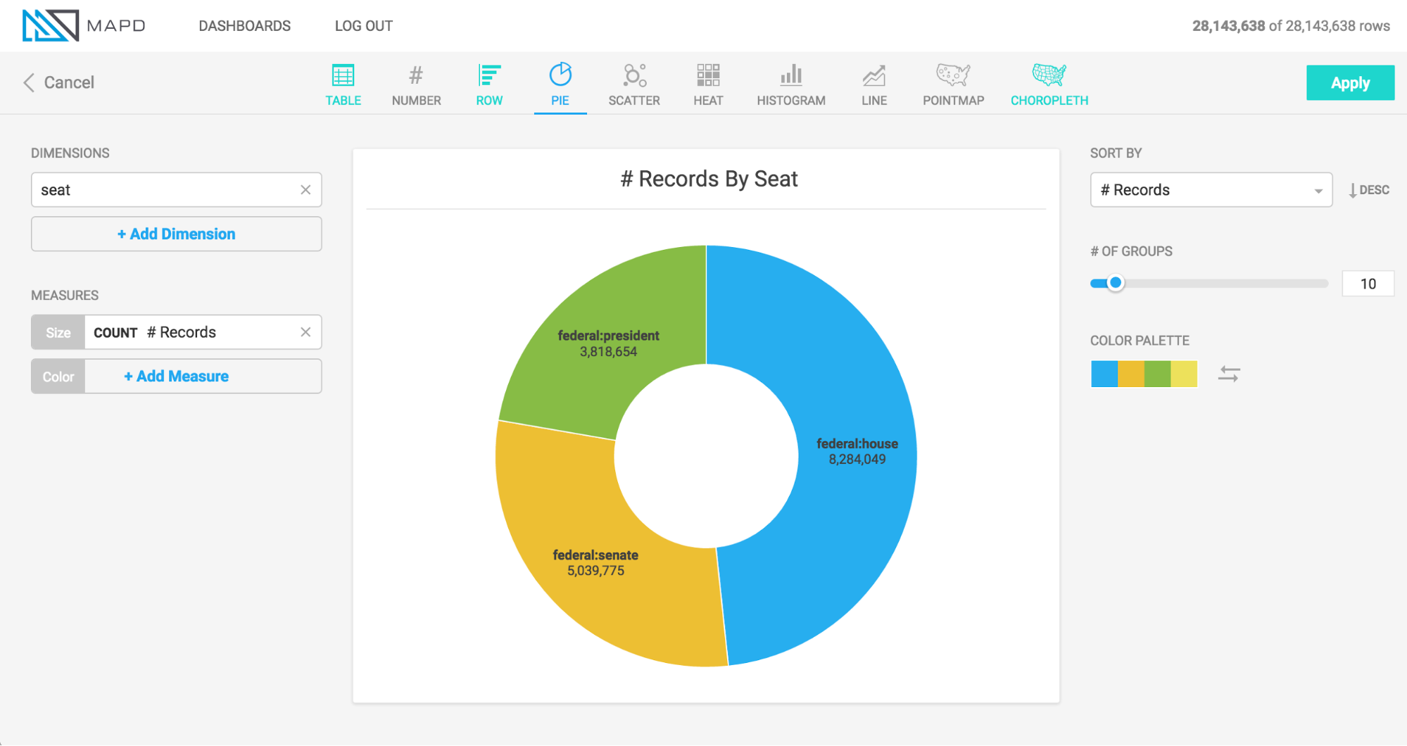
The animation below shows a pie chart being created for a political donations dataset. The dimension breaks out the data by political office, the size of the segments corresponds to the total amount raised, and the color of the segments represents the average donation amount.
This animation shows colors being set based on a numeric measure, but you can manually set the colors of categories arbitrarily.