Table Chart
What it is
A Table chart is a non-graphical output of data, either at the row level from the database, or with a grouping or aggregation. You can sort any grouped data to view the top or bottom records for a measure.
When to use it
Use Table charts to view raw information from the database at the most detailed level. For example, if your dashboard includes an aggregated chart such as a Bar chart, which presents an aggregated measure broken out by a particular dimension, a Table chart can be a useful supplementary chart to show every record underlying the aggregation. If you have a Bar chart of cars sold per town in the United States, you can have a table chart showing details on each automotive transaction. Clicking a dimension in the Bar chart shows the detailed records for that dimension in the Table chart.
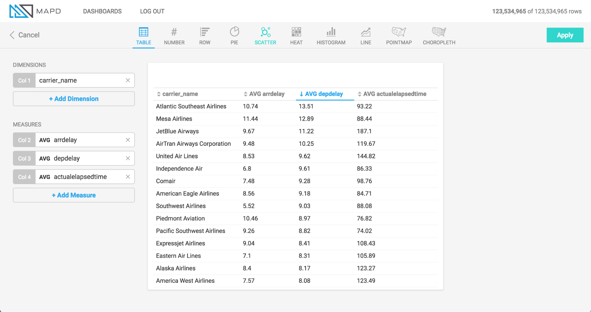
In addition to presenting row-level, non-grouped information from the database, you can also use Table charts to group information by a dimension, similar to most other chart types. Since other chart types have a limit on the number of measures that can be aggregated (Bubble chart has the most, at 4), you can use Table charts to view even more aggregated measures, since there is no restriction on the number of columns you can view.
How to set it up
The animation uses an airline flights dataset to show the setup of a table chart with 4 measure columns (arrival delay, departure delay, flight time, and destination city), and then the grouping of those columns by a Dimension (airline carrier name).
Note that before the carrier_name dimension is added to group the information, the information is displayed at the row level from the database, meaning each record corresponds with a row in the database table. Using this non-aggregated view is a unique and useful capability of the Table chart.