MapD Immerse Chart Types
MapD Immerse lets you visualize your data in the format that provides the clearest insight. Charts range from basic to complex, from aggregate to detail level. You can combine your charts together into dashboards to explore every dimension and level of your data.
Selecting a Chart Type
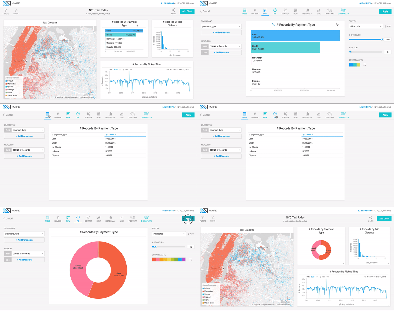
You can choose the chart type by toggling among the chart icons at the top of the chart editing screen. If you have already chosen dimensions and measures for a chart, Immerse indicates which other chart types are also capable of displaying that data by highlighting the chart icons in green.
Some charts require certain types of dimensions/measures and disallow others. As you switch between charts, you might see dimensions or measures become deactivated (grayed-out) if they are not appropriate for that chart type. Deactivated fields are discarded once you save a chart.
