Bubble Chart
What it is
The Bubble chart groups data into dots and places those dots on an x and y axis. Each axis represents a measure. You can size or color the dots by further measures, making the bubble chart capable of representing up to four measures for each group (x, y, size, and color).
When to use it
A Bubble chart can be useful in a few different situations, including: 1) a dataset where you expect there might be a correlation between the x measure and the y measure; 2) a dataset where a correlation is not necessarily expected, but you want to understand the distribution and influence of multiple factors, or to spot outliers.
For example, you can use a Bubble chart to examine automotive engine performance by plotting horsepower on the X axis and engine displacement on the Y axis. More displacement usually means more horsepower, so you would expect the dots to cluster along an angled line rising from left to right. To the extent that data deviates off of that imagined line, you might infer that engines falling above the line have unusually high efficiency.
How to set it up
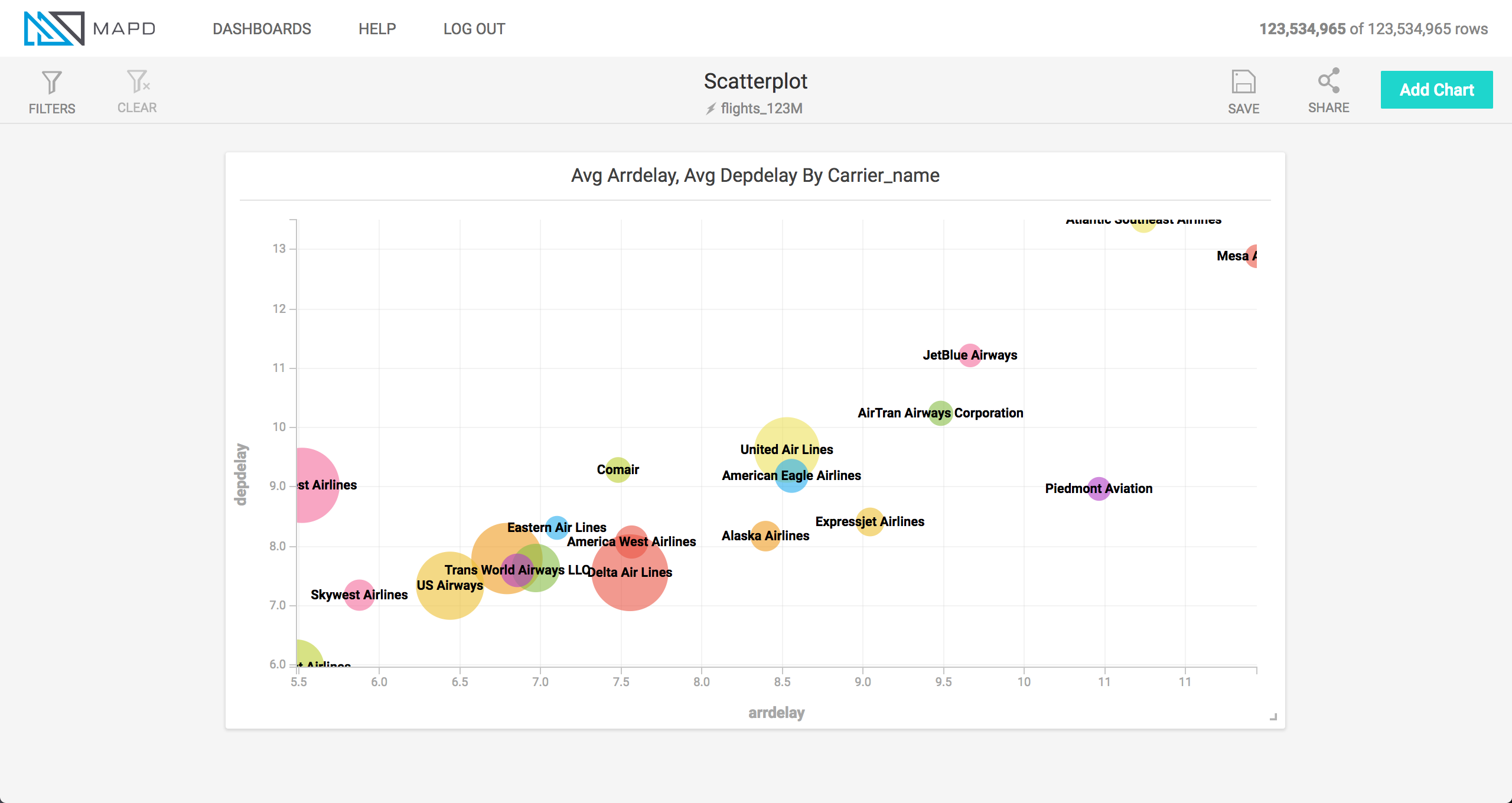
The animation below shows a Bubble chart being created for an airline flights dataset, with the dots representing airlines, the x and y axes representing flight arrival delay and departure delay, size representing the number of flights, and color representing the average length of flight.