Point Map
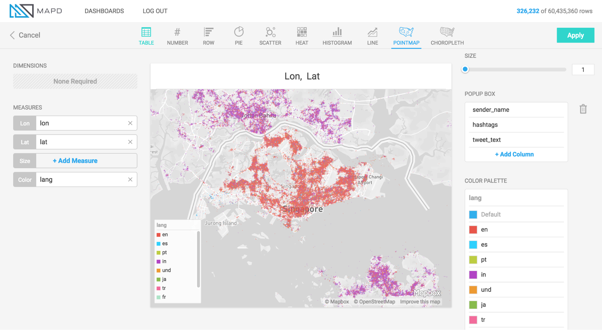
What it is
The Point map plots geographic latitude/longitude data to visualize the location of data on a map. In addition to location, points on the map can be sized and colored to represent measures of data. Hovering over a point can reveal a popup box with further details on that point.
When to use it
Use a Point map when you want to view a detailed, granular display of geographic information, and your data is at the latitude/longitude level of detail. The Point map does not aggregate data, but presents it as individual, lat/long rows from the database table (if you need aggregation of geographic data, use the Choropleth chart).
How to set it up
The animation below shows the selection of Longitude and Latitude measures to plot the location of points, and the selection of color and size measures, to add additional detail. The animation also shows the adjustment of settings for “Size Domain” and “Size Range,” which are used to adjust how points are sized.
Size Domain
The Size Domain setting lets you set minimum and maximum bounds for the Size Measure you choose. For example, in the animation below, which uses U.S. political contributions data, the Size Measure chosen at the left side of the screen is Amount, which has values from -5m to over 25m. The majority of political donations are not millions of dollars, and are not negative, so by adjusting Size Domain we can make sure the sizing of the dots on the pointmap is determined by a more realistic minimum/maximum bounds ($0 - $5,000 is used here).
Note that setting minimum/maximum bounds using Size Domain does not exclude values outside of those bounds from the dataset — they do still appear on the map. Rather, the Size Domain sets the minimum value, which is used to size the smallest point, and maximum value, which is used to size the largest point. For example, if you set the maximum for Size Domain to $5,000, any point greater than $5,000 is the same size as one which is $5,000.
The practical effect of Size Domain is to control the impact of outliers, and create a more informative map for the range of values that are most pertinent to your analysis.
Size Range
Size Range represents sizes of the smallest and largest points on the screen, measured in pixels. Points can range in size from 1 to 20 pixels. Note that if you set very large pixel values for the top of the range (for example, 20), the largest points might cover many smaller points that fall underneath them. Accordingly, setting size ranges is a balance between making it easy to spot the largest values with very large points, and comprehensiveness of the data that you can see (using smaller point ranges allows more points to be seen on the map).
Zoom and Select
Point map charts have additional features for zooming in and selecting details.
Zoom
You can select and zoom a specific region of a Point map. Hold the shift key, then drag a rectangular selection around the area on which you want to zoom. You can also zoom in and out using a mouse scrolling button.
The Zoom To box in the upper right corner of the map lets you enter a geographic location. You can enter the name of a country, a city, or even your home address, and the map will fly there for you.
Selection
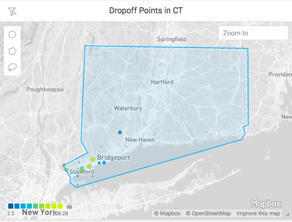
You can select geographic regions based on proximity or defined boundaries using the Circle, Polygon, and Lasso selection tools.
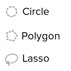
Circle Selector
Use the Circle tool to select an area around a specific central point. Click the Circle tool icon, then click anywhere on the map to create a circular selection.
To move the circle, click anywhere inside the selected area to select the circle. Drag the circle to the new location.
To resize the circle, click anywhere inside the selected area, then drag any of the white squares to scale the circle up or down.
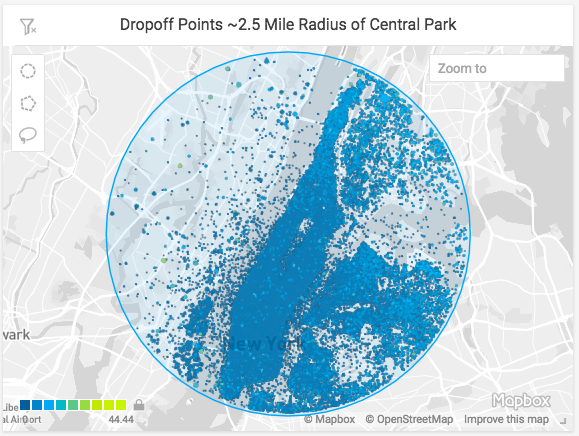
Due to the distortion inherent in Mercator map projections, the circumference of the selection is reduced as you get closer to the equator, and increased as you approach the poles. In the example below, all of the areas are the same number of meters in diameter, with the size of the selection circle adjusted to allow for Mercator distortion.
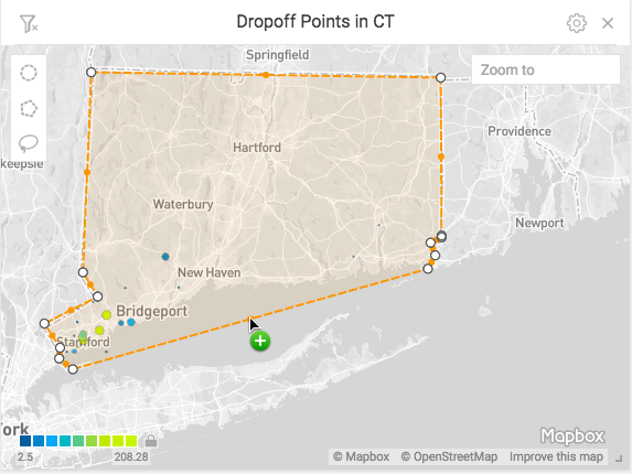
Polygon Selector
Use the Polygon tool to select an area with noncomplex angles. Click to set each point. As you draw the selection, you can hold the Shift key to contrain each line to 45° angle increments relative to the previous line.
To complete the selection, do one of the following:
- Double-click
- Click the starting point a second time
- Press Enter
To change the size of the selection, click anywhere in the selected region. Drag any of the white corner dots to resize the selection. Hold the Shift key to constrain the relative proportions of the selection. Hold the Alt key to scale the selection from the center.
To rotate the selection, mouse hover over any corner to display a curved arrow. Click and drag to rotate. Hold the Shift key to rotate in 45° increments.
To edit the endpoints in the selection, double-click anywhere in the region. Drag the white endpoints to new locations. To add an endpoint, click one of the small orange dots in the middle of a line segment; it becomes a new endpoint that you can drag to your desired position. To delete an endpoint, hold the Alt key and click the endpoint.
Note that if you create a selection where lines intersect the behavior is undefined and has unpredictable results.
Lasso Selector
Use the Lasso tool to trace around an area with curves or complex angles. Click to start, drag to draw the outline of your desired area, then release the mouse at any time to complete the selection with a straight line.
Once you have created your selection, the selection points are simplified, and the selection becomes effectively the same as a selection made with the Polygon tool.