Histogram
What it is
The Histogram displays the distribution of data across a continuous variable, by aggregating the data into bins of a fixed size. Vertical bars are used to show the count of data within each bin, with taller bars indicating areas of density within the dataset. In MapD Immerse, You can use Histograms to count occurrences of data other than the binned dimension (shown in “How to set it up” below).
When to use it
Use a Histogram to understand the distribution of your data, and to see
areas of unusually high or low density, which would be masked by a simple
aggregate such as Average.
How to set it up
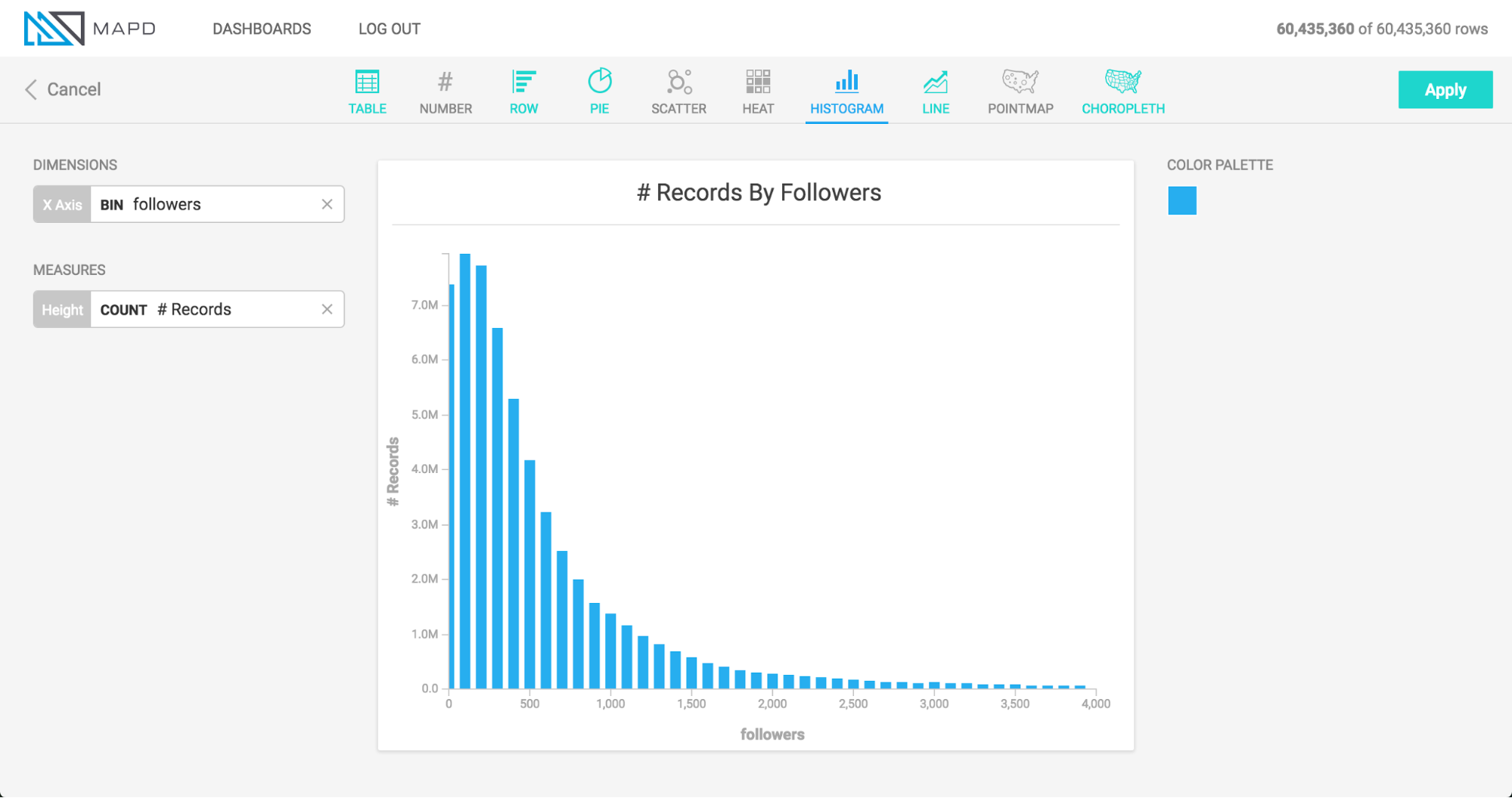
The animation below uses Twitter data to set up two histograms.
The first histogram in the animation shows the distribution of data for number of followers, indicating that a large number of people have fewer than 150 followers, followed by a diminishing “long tail” of people with more than that number.
The second histogram shown below forms bins based on one column (followers), but draws the vertical height of the bars based on count of a different column (the number of followees ). This allows us to see how the count of one column varies when viewed by groupings of another column. In this case, people with more followers also tend to follow more accounts themselves, up to the level of about 20,000 followers, at which point the relationship becomes more tenuous.
Once you have chosen your measure and dimension, you can edit the labels for the X and Y axes. Click the label and enter your custom text.