Tutorials
Introduction
Vega is a visualization specification language that describes how to map your source data to your viewing area. By creating a JSON Vega specification structure, you define the data and the transformations to apply to the data to produce meaningful visualizations. The specification includes the geometric shape that represents your data, scaling properties that map the data to the visualization area, and graphical rendering properties.
MapD uses Vega for backend rendering. Using the MapD Connector API, the client sends the Vega JSON to the backend, which renders the visualization and returns a PNG image for display. See the MapD Charting Examples for backend rendering examples.
These tutorials introduce you to common Vega specification patterns so you can start creating visualizations quickly and easily. Each tutorial uses a code example that demonstrates a particular Vega feature or pattern. The Getting Started with Vega tutorial covers basic Vega concepts using the tweets example you saw in Vega at a Glance. It serves as the foundation for the tutorials that follow, and introduces you to the API for communication with the backend. After you understand the fundamental Vega concepts presented in these tutorials, refer to the Vega Reference document to create more complex visualizations using the full capabilities of Vega.
You can find the source code for each tutorial in the Example Source Code document. These and the MapD Charting Examples can be used to gain a better understanding of Vega by experimenting with them to create new visualizations on your own MapD system and database.
Tutorial Framework
Because the tutorials focus on the Vega specification, they use a simple client implementation that sends the render request to the MapD server and handles the response:
<!DOCTYPE html>
<html lang="en">
  <head>
    <title>MapD</title>
    <meta charset="UTF-8">
  </head>
  <body>
    <script src="js/browser-connector.js"></script>
    <script src="js/vegaspec.js"></script>
    <script src="js/vegademo.js"></script>

    <script>
    document.addEventListener('DOMContentLoaded', init, false);
    </script>
  </body>
</html>
function init() {
    var conn = new MapdCon()
        .protocol("http")
        .host("my.host.com")
        .port("9092")
        .dbName("mapd")
        .user("mapd")
        .password("changeme")
        .connect(function(error, con) {
          con.renderVega(1, JSON.stringify(exampleVega), vegaOptions, function(error, result) {
            if (error) {
              console.log(error.message);
            }
            else {
              var blobUrl = `data:image/png;base64,${result.image}`
              var body = document.querySelector('body')
              var vegaImg = new Image()
              vegaImg.src = blobUrl
              body.append(vegaImg)
            }
          });
        });
}
The renderVega() function sends the exampleVega JSON structure described in the tutorials. The first, Getting Started with Vega tutorial covers Vega library dependencies and the renderVega() function in more detail.
Finding the Cause of Errors
On a connection error, you can view the error message to determine the cause of the error. To determine the cause of Vega specification errors, catch and handle the renderVega() exception, as shown.
Getting Started with Vega
Source code: Getting Started
This tutorial uses the same visualization used in the Vega at a Glance document but elaborates on the runtime environment and implementation steps. The Vega usage pattern described here applies to all Vega implementations. Subsequent tutorials differ only in describing more advanced Vega features.
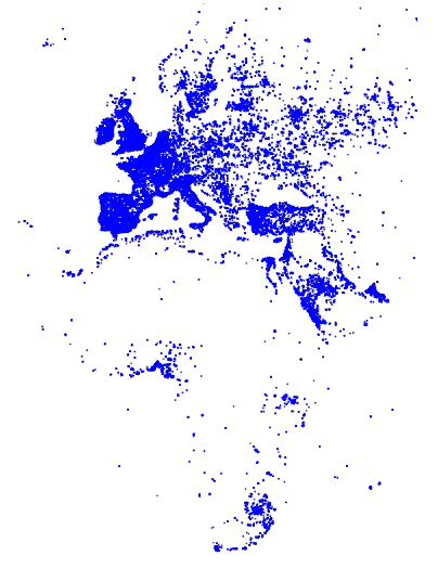
This visualization maps a continuous, quantitative input domain to a continuous output range. Again, the visualization shows tweets in the EMEA region, from a tweets data table:
Backend rendering using Vega involves the following steps:
You can create the Vega specification statically, as shown in this tutorial, or programmatically. See the Poly Map with Backend Rendering charting example for a programmatic implementation. Here is the programmatic source code:
Step 1 - Create the Vega Specification
A Vega JSON specification has the following general structure:
const exampleVega = {
  width: <numeric>,
  height: <numeric>,
  data: [ ... ],
  scales: [ ... ],
  marks: [ ... ]
};
Specify the Visualization Area
The width and height properties define the width and height of your visualization area, in pixels:
const exampleVega = {
  width: 384,
  height: 564,
  data: [ ... ],
  scales: [ ... ],
  marks: [ ... ]
};
Specify the Data Source
This example uses the following SQL statement to get the tweets data:
data: [
    {
        "name": "tweets",
        "sql": "SELECT goog_x as x, goog_y as y, tweets_nov_feb.rowid FROM tweets_nov_feb"
    }
]
The input data are the latitude and longitude coordinates of tweets from the tweets_nov_feb data table. The coordinates are labeled x and y for Field Reference in the marks property, which references the data using the tweets name.
Specify the Graphical Properties of the Rendered Data Item
The marks property specifies the graphical attributes of how each data item is rendered:
marks: [
    {
        type: "points",
        from: {
            data: "tweets"
        },
        properties: {
            x: {
                scale: "x",
                field: "x"
            },
            y: {
                scale: "y",
                field: "y"
            },
            "fillColor": "blue",
            size: {
                value: 3
            }
        }
    }
]
In this example, each data item from the tweets data table is rendered as a point. The points marks type includes position, fill color and size attributes. The marks properties property specifies how to visually encode points according to these attributes. Points in this example are three pixels in diameter and colored blue.
Additionally, points are scaled to the visualization area according to the following scales specification.
Specify How Input Data are Scaled to the Visualization Area
The scales property maps marks to the visualization area.
scales: [
    {
        name: "x",
        type: "linear",
        domain: [
            -3650484.1235206556,
            7413325.514451755
        ],
        range: "width"
      },
      {
        name: "y",
        type: "linear",
        domain: [
            -5778161.9183506705,
            10471808.487466192
        ],
        range: "height"
    }
]
Both x and y scales specify a linear mapping of the continuous, quantitative input domain to a continuous output range. In this example, input data values are transformed to predefined width and height range values.
Subsequent tutorials show how to specify data transformation using discrete domain-to-range mapping.
Step 2 - Connect to the Backend
Use the browser-connector.js renderVega() API to communicate with the backend. The connector is layered on Apache Thrift for cross-language, client communication with the server.
Use the following steps to instantiate the connector and to connect to the backend:
- Include
browser-connector.jslocated at https://github.com/mapd/mapd-connector/tree/master/dist to include the MapD connector and Thrift interface APIs.
<script src="<localJSdir>/browser-connector.js"></script>
- Instantiate the
MapdCon()connector and set the server name, protocol information, and your authentication credentials, as described in the MapD Connector API:
var vegaOptions = {}
var connector = new MapdCon()
  .protocol("http")
  .host("mahakali.mapd.com")
  .port("9092")
  .dbName("mapd")
  .user("mapd")
  .password("HyperInteractive")
Property Description dbNameMapD database name. hostMapD web server name. passwordMapD user password. portMapD web server port protocolCommunication protocol: http,httpsuserMapD user name.
- Finally, call the MapD connector API connect() function to initiate a connect request, passing a callback function with a
(error, success)signature as the parameter.
For example,
.connect(function(error, con) { ... });
The connect() function generates client and session IDs for this connection instance, which are unique for each instance and are used in subsequent API calls for the session.
On a successful connection, the callback function is called. The callback function in this example calls the renderVega() function.
Step 3 - Make the Render Request and Handle the Response
The MapD connector API renderVega() function sends the Vega JSON to the backend, and has the following parameters:
.connect(function(error, con) {
  con.renderVega(1, JSON.stringify(exampleVega), vegaOptions, function(error, result) {
    if (error)
      console.log(error.message);
    else {
      var blobUrl = `data:image/png;base64,${result.image}`
      var body = document.querySelector('body')
      var vegaImg = new Image()
      vegaImg.src = blobUrl
      body.append(vegaImg)
    }
  });
});
| Parameter | Type | Required | Description |
|---|---|---|---|
widgetid |
number | X | Calling widget ID. |
vega |
string | X | Vega JSON object, as described in Step 1 - Create the Vega Specification. |
options |
number | Render query options.
|
|
callback |
function | Callback function with (error, success) signature. |
| Return | Description |
|---|---|
| Base 64 Image | PNG image rendered on server |
The backend returns the rendered base64 image in results.image, which you can display in the browser window using a data URI.
Summary
This tutorial reviewed the Vega specification, showed you how to set up your environment to communicate with the backend, and how to use renderVega() to make a render request. These basic concepts are the foundation of the remaining tutorials, which focus on other Vega features.
Getting More from Your Data
Source code: Getting More from Your Data
This tutorial builds on the Getting Started with Vega tutorial by color-coding tweets according to language:
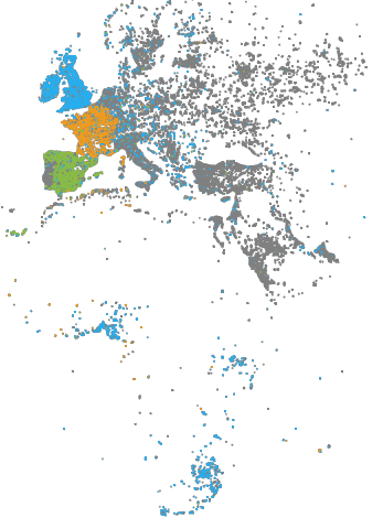
- Tweets in English are blue.
- Tweets in French are orange.
- Tweets in Spanish are green.
- All other tweets are light or dark gray.
To highlight language in the visualization, the example specifies the language column query in the Vega data property, and associates language with color.
"data:" [
  {
    "name": "tweets",
    "sql": "SELECT goog_x as x, goog_y as y, lang as color, tweets_nov_feb.rowid FROM tweets_nov_feb"
  }
The Scales Property property maps the language abbreviation string to a color value. Because we want to map discrete domain values to discrete range values, we specify a color scale with an ordinal type scale:
"scales:" [
     .
     .
     .
  {
    "name": "color",
    "type": "ordinal",
    "domain": ["en",  "es", "fr"],
    "range": ["#27aeef", "#87bc45", "#ef9b20"],
    "default": "gray",
    "nullValue": "#cacaca"
  }
]
You can specify a default color values for values not specified in range and for data items with a value of null. In this example, tweets in languages other than English, Spanish, or French are colored gray and tweets with a language value of null are colored light gray (#cacaca).
Similar to using x and y scales to map Marks Property property x and y fields to the visualization area, you can scale the fillColor property to the visualization area.
In previous examples the fill color of points representing tweets was statically specified as blue:
"marks:" [
  {
    "type:" "points",
    "from:" {
      "data:" "tweets"
    },
    "properties:" {
         .
         .
         .
      },
      "fillColor": "blue",
      "size:" {"value:" 3}
    }
  }
]
This example, uses Value Reference to specify the fill color:
"marks:" [
  {
    "type:" "points",
    "from:" {
      "data:" "tweets"
    },
    "properties:" {
         .
         .
         .
      },
      "fillColor:" {
        "scale": "color",
        "field": "color"
      },
      "size:" 3
    }
  }
]
The fillColor references the color scale and performs a lookup on the current language value, from the color data table field.
This tutorial showed you how to use marks properties with an ordinal type scale to visualize more information about your data. The following tutorials introduce you to scale and polys marks types and the quantize scales type for more advanced visualizations.
Creating More Advanced Charts
Source code: Creating More Advanced Charts
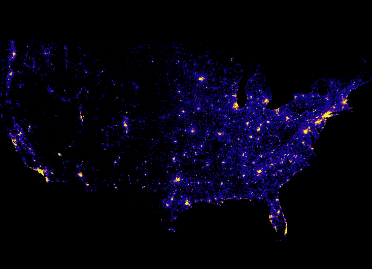
This tutorial introduces you to Symbol Type marks type by creating a heatmap visualization. The heatmap shows contribution level to the Republican party within the continental United States:
The contribution data are obtained using the following SQL query:
"data": [
  {
   "name": "heatmap_query",
   "sql": "SELECT rect_pixel_bin(conv_4326_900913_x(lon), -13847031.457875465, -7451726.712679257, 733, 733) as x,
           rect_pixel_bin(conv_4326_900913_y(lat), 2346114.147993467, 6970277.197053557, 530, 530) as y,
           SUM(amount) as cnt
           FROM contributions
           WHERE (lon >= -124.39000000000038 AND lon <= -66.93999999999943) AND
               (lat >= 20.61570573311549 AND lat <= 52.93117449504004) AND
               amount > 0 AND
               recipient_party = 'R'
           GROUP BY x, y"
  }
]
The visualization uses a Symbol Type marks type to represent each data item in the heatmap_query data table:
"marks": [
    {
        "type": "symbol",
        "from": {
            "data": "heatmap_query"
        },
        "properties": { ... elided ... }
    }
]
The marks properties property specifies the symbol shape, which is a square. Each square has a pixel width and height of one pixel.
"marks": [
    {
        ... elided ...

        "properties": {
            "shape": "square",
            "x": {
                "field": "x"
            },
            "y": {
                "field": "y"
            },
            "width": 1,
            "height": 1,
            "fillColor": {
                "scale": "heat_color",
                "field": "cnt"
            }
        }
    }
]
Notice that the data x and y location values do not reference a scale. The location values are the values of the SQL query, transformed using extension functions.
The fill color of the square uses the heat_color scale to determine the color used to represent the data item:
Quantize scales are similar to linear scales, except they use a discrete rather than continuous range. The continuous input domain is divided into uniform segments based on the number of values in the output range.
"scales": [
    {
        "name": "heat_color",
        "type": "quantize",
        "domain": [
            10000.0,
            1000000.0
        ],
        "range": [ "#0d0887", "#2a0593", "#41049d", "#5601a4", "#6a00a8",
                   "#7e03a8", "#8f0da4", "#a11b9b", "#b12a90", "#bf3984",
                   "#cb4679", "#d6556d", "#e16462", "#ea7457", "#f2844b",
                   "#f89540", "#fca636", "#feba2c", "#fcce25", "#f7e425", "#f0f921"
        ],
        "default": "#0d0887",
        "nullValue": "#0d0887"
    }
]
For a heatmap shows a continuous input domain divided into uniform segments based on the number of values in the output range. This is a quantize scales type. In the example, dollar amounts between $10,000 and $1 million are uniformly divided among 21 range values, where the larger amounts are represented by brighter colors.
Values outside the domain and null values are rendered as dark blue, #0d0887.
Working with Polys Marks Type
Source code: Working with Polys Marks Type
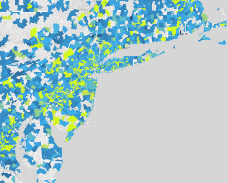
This tutorial introduces you to the Polys Type marks, which uses an implicit polygon data table format. The visualization is a map of zip codes color-coded according to average contribution amount. The data table encodes polygons representing zip code areas.
See the Poly Map with Backend Rendering charting example for a programmatic rendering of this visualization.
The following data property extracts the average contribution amount from the contributions_donotmodify data table, omitting rows that do not have a contribution amount:
"data": [
  {
    "name": "polys",
    "format": "polys",
    "sql": "SELECT zipcodes.rowid,AVG(contributions_donotmodify.amount) AS avgContrib FROM contributions_donotmodify,zipcodes WHERE contributions_donotmodify.amount IS NOT NULL AND contributions_donotmodify.contributor_zipcode = zipcodes.ZCTA5CE10 GROUP BY zipcodes.rowid ORDER BY avgContrib DESC"
  }
]
When working with polygon data, the "format": "polys" property must be specified.
The scales specification scales x values to the visualization area width and y values to the height. A color scale, polys_fillColor is also specified that linearly scales nine contribution amount ranges to nine colors:
"scales": [
  {
    "name": "x",
    "type": "linear",
    "domain": [-19646150.75527339, 19646150.755273417],
    "range": "width"
  },
  {
    "name": "y",
    "type": "linear",
    "domain": [-3071257.58106188, 10078357.267122284],
    "range": "height"
  },
  {
    "name": "polys_fillColor",
    "type": "linear",
    "domain": [0, 325, 650, 975, 1300, 1625, 1950, 2275, 2600],
    "range": ["#115f9a", "#1984c5", "#22a7f0", "#48b5c4", "#76c68f", "#a6d75b", "#c9e52f", "#d0ee11", "#d0f400"],
    "default": "green"
  }
]
Zip code areas whose average contribution amounts are not specified by the domain are color-coded green.
The marks property specifies visually encoding the data from the polys data table as polygons:
"marks": [
  {
    "type": "polys",
    "from": { "data": "polys" },

       ... elided ...

    }
  }
]
Polygon x and y vertex locations are transformed to the visualization area using the x and y scales.
"marks": [
  {
       ... elided ...

    "properties": {
      "x": {
        "scale": "x",
        "field": "x"
      },
      "y": {
        "scale": "y",
        "field": "y"
      },
       ... elided ...
    }
  }
]
The x and y polygon vertex locations are implicitly encoded in the data table as described in Polys Type.
Polygon fill color color-codes the average contribution amount, avgContrib, linearly scaled by the polys_fillColor scale:
"marks": [
  {
       ... elided ...

    "properties": {

       ... elided ...

      "fillColor": {
        "scale": "polys_fillColor",
        "field": "avgContrib"
      },

       ... elided ...

    }
  }
]
Finally, the marks property specifies the polygon border width and color, and line join constraints:
"marks": [
  {
       ... elided ...

    "properties": {

       ... elided ...

      "strokeColor": "white",
      "strokeWidth": 0,
      "lineJoin": "miter",
      "miterLimit": 10
    }
  }
]
This tutorial introduced you to the polys marks type. The main difference between this and other types is vertices, indices, and their grouping are implicitly encoded in the data table.