Using Filters
Immerse lets you narrow the data in your visualizations by clicking on areas of the chart on which you want to filter.
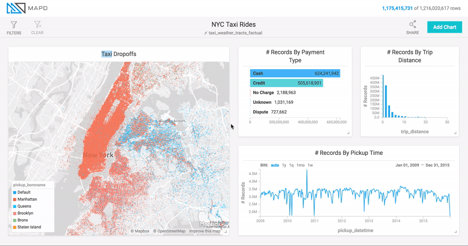
For line and histogram charts, filter by dragging left or right along the chart to select a range (brushing).
For point map and scatter plots, filter by zooming in on regions. Hold the shift key to select a rectangular area of the map and zoom in. You can also use the mouse wheel or trackpad to zoom in and out.
Point maps also provide a Zoom To field, where you can zoom to a particular geographic location by name. You can enter a country, a city, or something as specific as a street address.
For other charts, click the section of the chart on which you want to focus.
Inverse Filters
You can also choose to filter out certain data. Click the chart while holding down the Command key (Macintosh) or Control key (Windows/Linux). This feature is available for all chart types other than line, histogram, point map, and number.
Global Filters
Immerse lets you filter data at the dashboard level, constraining
data for all charts on the dashboard. At the top of the dashboard
screen, click Filters / Add Filter, then select the column on which
you want to filter. Depending on the data type of the column, Immerse offers
appropriate ways of filtering for that type. For example, on string columns you can search using options such as Contains or Equals.