Measures and Dimensions
Charts are comprised of measures and dimensions. Measures are values or aggregated values. Dimensions categorize measures. The measure and dimension requirements for each chart type are discussed in MapD Immerse Chart Types.
Measures
Typically, measures are calculated fields such as SUM, AVERAGE, etc. Immerse creates charts by plotting these calculated values. This lets you visually compare measures of one dimension with another.
If you select a numerical column as a measure, you can aggregate that column as AVERAGE, MIN, MAX, or SUM. If you select a string column (that is, a column of text values), Immerse automatically aggregates by COUNT UNIQUE, which returns the count of distinct strings in that column.
Depending on the chart, Immerse can visualize anywhere from one to four measures. A Pie chart, for example, offers 2 measures, Size and Color. Whichever column you choose as the size measure is used to determine the size of the slices in the pie chart. Color is an optional second measure for Pie Chart, allowing another layer of information to be visualized on the same chart. For example, you can size the Pie’s slices by the number of sales opportunities that are closed, and color them by the average income from those sales.
A more complex chart, such as a scatter plot, can concurrently visualize up to four measures. Scatter plots show values on a two-dimensional matrix, based on an X measure and a Y measure. Additionally, the dots used in the scatterplot can be sized and colored by two additional measures, for a total of four measures.
Special Behavior with Table Charts, for Measures
Table charts are a non-graphical, row/column presentation of raw data. Measures can behave differently than with other chart types. If you create a table chart with measures but no dimensions, the data is not grouped; the chart presents raw information at the row level from the database. If you create a table chart with dimensions, the measures act in their usual way, as an aggregate calculation. If you want to view raw, row-level information from the database without performing any transformations or calculations, create a table chart with measures but no dimensions.
Custom Measures
In addition to normal measures, which perform simple aggregation calculations on data, you can create custom measures that perform arbitrary SQL aggregations for any MapD supported SQL. Consider the following standard SQL query:
SELECT column1, COUNT(column1) FROM table WHERE column1=’foo’ GROUP BY column1
The custom measure can be any aggregate statement that can be substituted for the term COUNT(column1) above.
To enter a Custom SQL Measure query:
- Create or edit a chart.
- From the Add Measure pop-up, choose Custom SQL Measure.
- Enter an Alias for the SQL query.
- Enter the SQL query.
- Click OK.
For example, if you have a table with Price, Quantity, and Tax columns, you can compute the Subtotal using the custom SQL query Quantity * Price and the Total using the custom SQL query``(Quantity * Price) + (Quantity * Price * Tax)``.
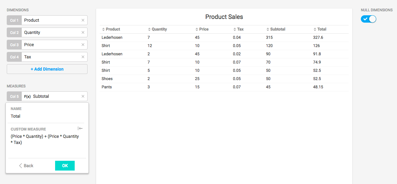
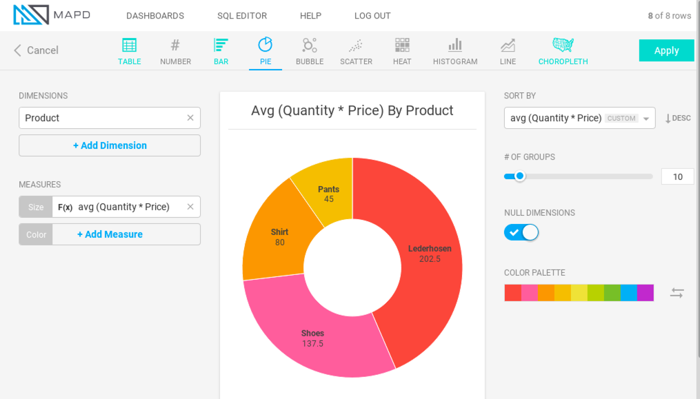
You can check to see which products bring in most average gross sales by finding the average of the Quantity * Price.
Since most Immerse charts require dimensions, which group the data, custom measures for those charts always need to be written as aggregate statements, as in the examples above. However, for charts that do not require dimensions, such as a point map or table, you can write custom measures that are not aggregate statements.
Dimensions
Dimensions are the grouped columns in a query. For example, if a table lists every car sold in the United States, and you want to display the number of cars sold per manufacturer, the dimension is car manufacturer (that is, the query results are grouped by manufacturer).
A query can have more than one dimension. For example, the number of cars sold by car manufacturer, by state. When a chart has multiple dimensions, the dimensions are separated by forward slashes (/). For example, the car manufacturer by state would display “Chevrolet / California.” Table Charts display multiple dimensions in separate table columns. You can change the order of dimensions by dragging and dropping the dimensions.
Certain chart types have restrictions on the types of dimensions you can use. For example, histograms and line charts can only have numerical dimensions. Choropleths can only have dimensions that reflect geographic regions. Pointmaps have no dimensions, since they display geographic points at the latitude/longitude level only. Number charts have no dimensions, since their purpose is to present only a single number.
Binned dimensions
When a dimension is set to a numerical column, Immerse presents information grouped by each number. If there are many numbers, Immerse automatically creates binned ranges of numbers. For example, if you have a table with many distinct numbers from 1 to 1 million, a display of 10 bins would be 1 - 100,000, 100,001 - 200,000, and so on.
You can manually disable automatic binning to force the display of all numbers in the dimension. Depending on the expense of the query, Immerse might display a notification that the unbinned query is not available.
Null Dimensions
Many times, measures have no entry for a dimension. A null value might or might not be significant. For the measure Baggage_Fee, a null value might be considered “no fee collected,” and could be useful information. For the measure Departure_City, a null value is spurious data, because an airline flight has to take off from somewhere. Spurious data can skew the accuracy of your chart.
You can choose to omit null dimensions from Table, Bar, Bubble, and Heatmap charts to visualize only existing data values.
Custom Dimensions
You can create custom dimensions that group query results by using MapD supported SQL. Consider the following standard SQL query:
SELECT column1, COUNT(column1) FROM table WHERE column1=’foo’ GROUP BY column1
You can create a custom dimension using any statement that could replace the GROUP BY clause in the preceding query.
To enter a Custom SQL Dimension query:
- Create or edit a chart.
- From the Add Dimension pop-up, choose Custom SQL Dimension.
- Enter an Alias for the SQL query.
- Enter the SQL query.
- Click OK.
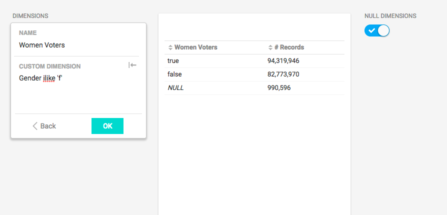
For example, looking at a dataset of voters from the 2016 election, you might want to know how many voters identified themselves as female. The custom SQL statement is Gender ilike 'f'. The Alias is Women Voters.
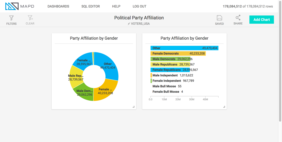
You can use a case statement to create a new dimension from one or more columns. For example you can query based on gender and party affiliation.
case
when Parties like 'Democratic' and Gender like '%F%' then 'Female Democrats'
when Parties like 'Democratic' and Gender like '%M%' then 'Male Democrats'
when Parties like 'Republican' and Gender like '%F%' then 'Female Republicans'
when Parties like 'Republican' and Gender like '%M%' then 'Male Republicans'
when Parties like '%Ind%' and Gender like '%F%' then 'Female Independent'
when Parties like '%Ind%' and Gender like '%M%' then 'Male Independent'
when Parties like '%Bull%' and Gender like '%F%' then 'Female Bull Moose'
when Parties like '%Bull%' and Gender like '%M%' then 'Male Bull Moose'
else 'Other' end
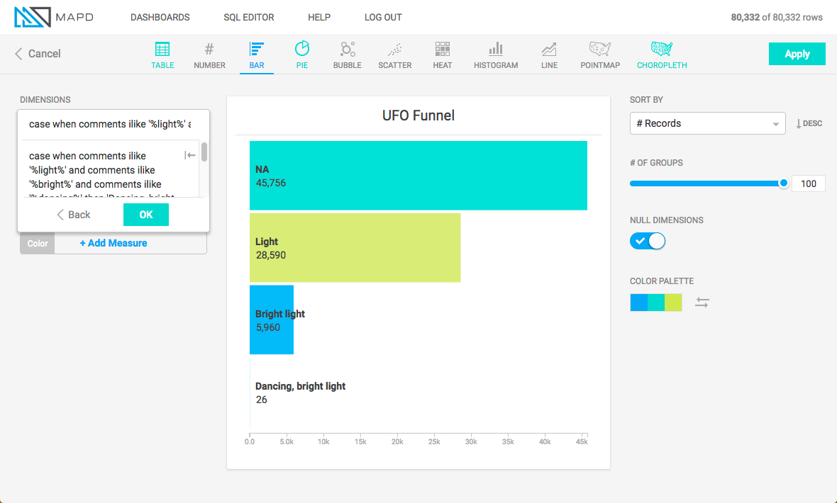
Another application of the case statement is to create a funnel that aggregates data at an increasing level of specificity. For example, this SQL query creates a chart that shows the number of UFO sightings based on an accumulation of common factors.
case
when comments ilike '%light%' and comments ilike '%bright%' and comments ilike '%dancing%' then 'Dancing, bright light'
when comments ilike '%light%' and comments like '%bright%' then 'Bright light'
when comments ilike '%light%' then 'Light'
else 'NA'
end