Bubble Chart
A Bubble chart is a variation of the Scatter Plot. Aggregated data is grouped by dimension into circles displayed on an x/y axis. Additional measures change the size or color of the circles. A Bubble chart can represent up to four measures for your chosen dimensions (x, y, size, and color).
| Features | Quantity | Notes |
|---|---|---|
| Required Dimensions | 1+ | Minimum 1, no limit, null dimensions optional. |
| Required Measures | 2-4 | Measure 1 = x axis, Measure 2 = y axis, Measure 3 = bubble size, Measure 4 = bubble color. |
Use a Bubble chart to show a correlation between the x measure and the y measure. When you do not expect a correlation, you can use a Bubble chart to understand the distribution and influence of multiple factors.
Bubble Chart Examples
Create a new Bubble chart. Choose a Data Source. This example graphs employment statistics for all 50 United States for the years 1980-2015. The data is available at the University of Kentucky website.
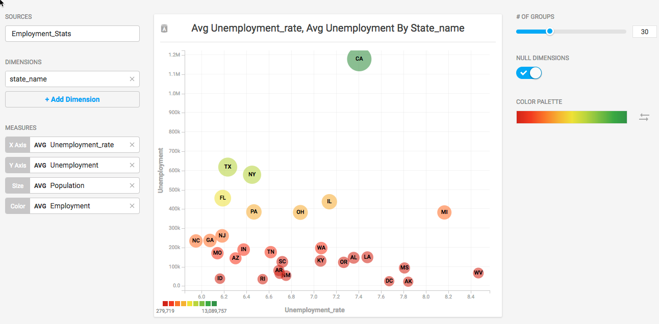
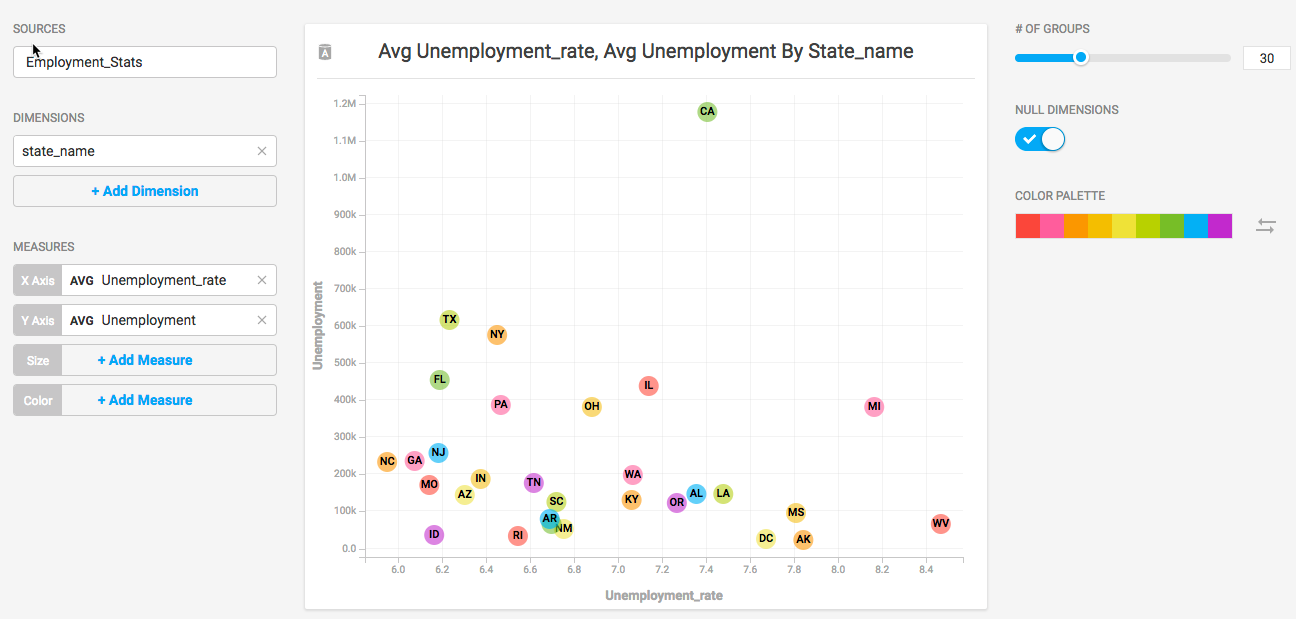
State_name is a handy dimension for this data. Use the average Unemployment_rate as the X Axis, and the average Unemployment total for the Y Axis. Increase the # of Groups to 50 to create an individual bubble for each state.
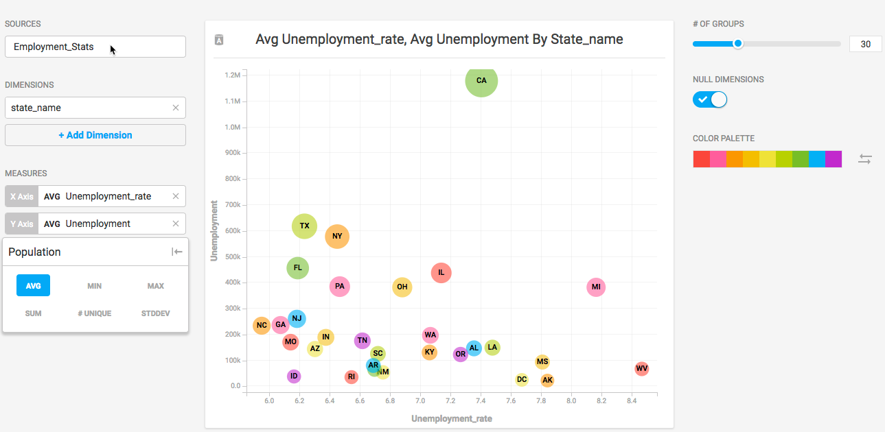
California has a significantly higher number of unemployed residents compared with the other states. Bubble charts are a good way to show outliers in a dataset. But that figure might be misleading. One reason for a higher average number of unemployed persons might be the fact that California is the most populous state in the country. Use Population as the Size measure to create proportionally sized bubbles, based on total population.
You can add Employment as the Color measure, which casts California in a more favorable light.