Histogram
The Histogram displays the distribution of data across a continuous (typically time-based) variable, by aggregating the data into bins of a fixed size. Vertical bars show the count of data within each bin.
| Features | Quantity | Notes |
|---|---|---|
| Required Dimensions | 1-2 | Dimension 1 = X Axis, Dimension 2 = Series |
| Required Measures | 1 | Measure 1 = Height. |
Histograms can count occurrences of data other than the binned dimension by assigning a series.
Use a Histogram to understand the distribution of your data, and to see areas of unusually high or low density, which would be masked by an aggregate such as Average.
Once you choose your measure and dimension, you can edit the labels for the X and Y axes. Click the label and enter your custom text.
You can change the range of values by “brushing” over the range chart, or by entering fixed start and end values on the X Axis.
Histogram Examples
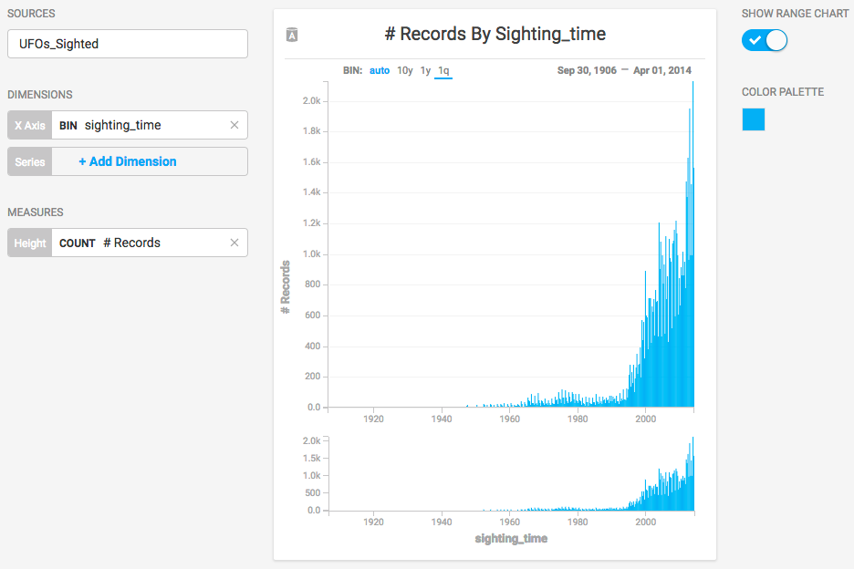
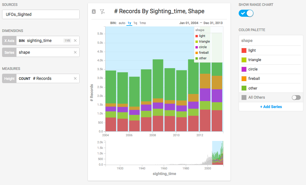
Choose a Data Source. This example uses the official database of UFO sightings
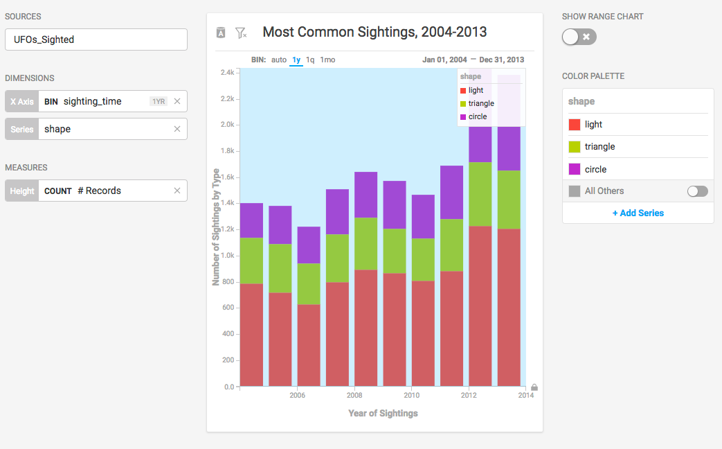
This chart categorizes UFO sightings on the dimension of sighting_time and uses the number of sightings as the measure.
Adding the dimension of shape displays the relative number of sighting types within each time-based bin.
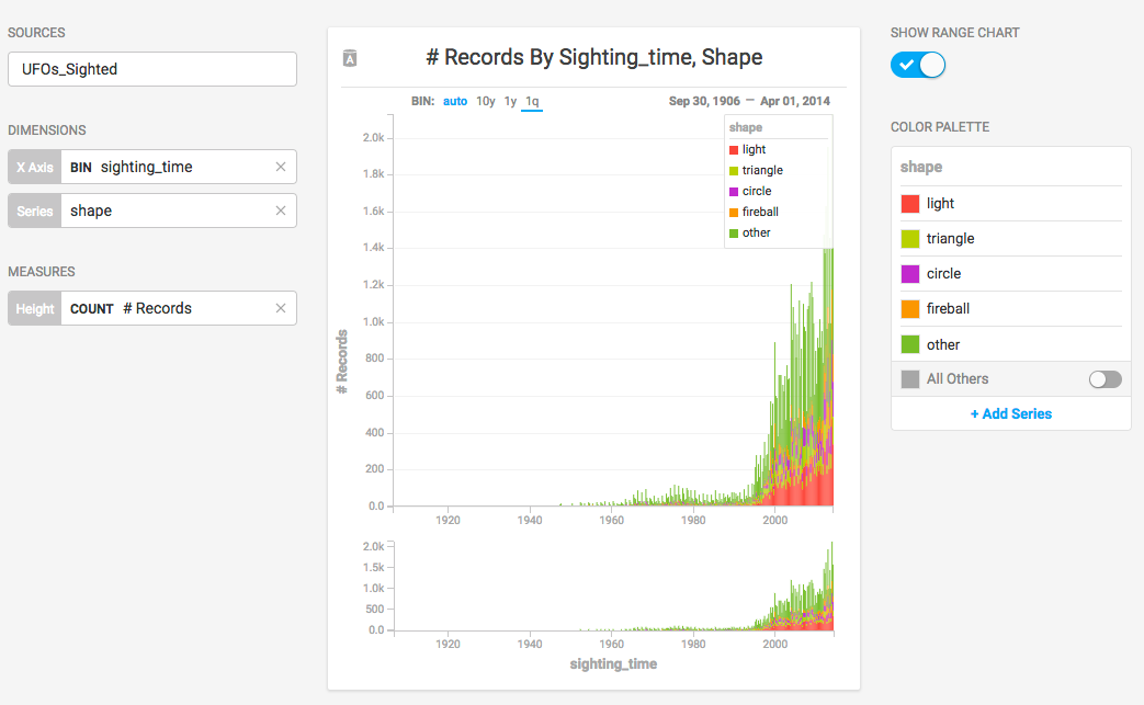
The records go back to 1905, with very few recorded sightings. Selecting a more recent 10-year block presents information in a more digestible form. For an ad hoc report, you can brush across values in the Range Chart to filter a smaller number of bins, or you can enter start and end dates on the x axis for precise values.
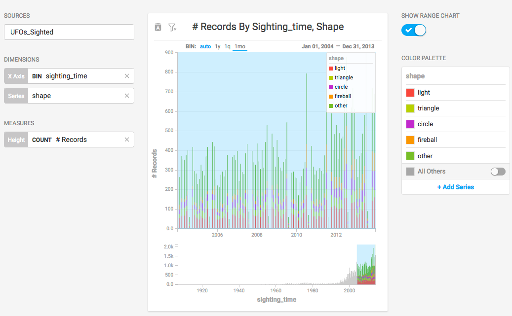
When you set the x axis to a date/time value, you have the option of setting the bin size to month, quarter, or year. Setting the bin size to 1y lets you compare the aggregate values at a glance.
Once you set the boundaries for the x axis, you can turn off the SHOW RANGE CHART setting. You can also reduce the number of series displayed by removing their entries on the COLOR PALETTE.
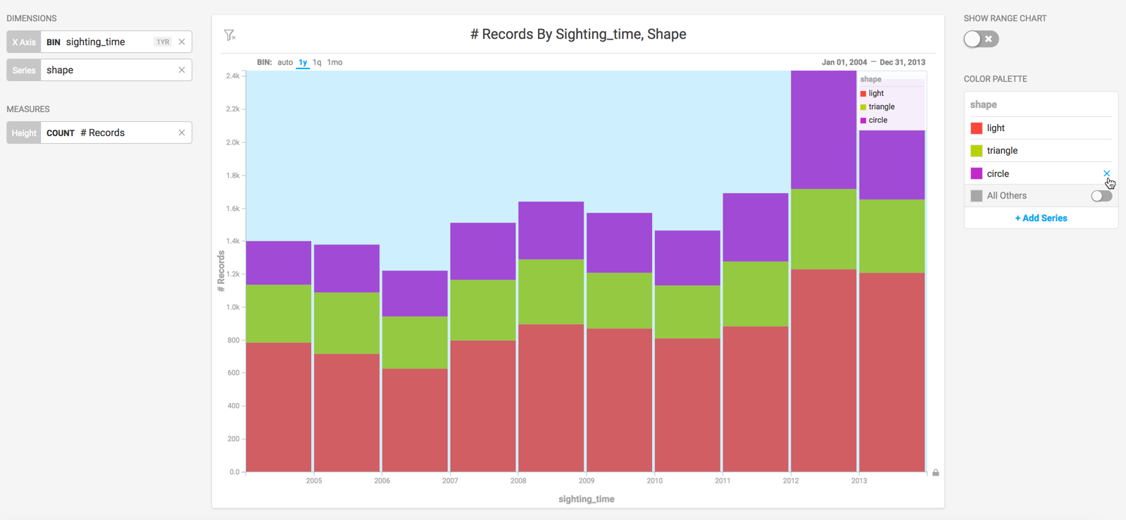
After you reduce the scope of the chart, you can change the labels on the axes and the chart title to reflect the current state of the information.