Scatter Plot
The Scatter Plot displays unaggregated, row-level data as points, plotting the points along an x and y axis. Each axis represents a quantitative measure. You can use additional measures to change the size or color points, making the scatter plot capable of representing up to four measures for each group (x, y, size, and color).
| Features | Quantity | Notes |
|---|---|---|
| Required Dimensions | 0 | No dimensions. |
| Required Measures | 1-4 | Measure 1 = X Axis, Measure 2 = Y Axis, Measure 3 = Point Size, Measure 4 = Point Color. |
Scatter plots resemble Bubble charts, but are used to view unaggregated data while Bubble charts aggregate data.
Use a scatter plot chart to study the correlation between two measures, or to spot outliers or clusters in the distribution of data. You can use a Scatter Plot to visualize any dataset, but they are most useful for exploring large amounts of data.
Mark Shape
Mark Shape lets you choose from a variety of shapes to use as data point markers in your Scatter Plot chart. Choosing the correct shape can make data values stand out more clearly, and help to differentiate values on layered charts.
Scatter Plot Example
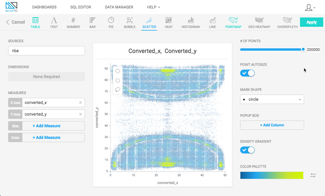
Create a new Scatter Plot chart. For the Data Source, this example uses NBA Play-by-play Stats from nbastuffer.com.
Set the X Axis set to converted_x and Y Axis set to converted_y. These represent the places on the basketball court where shots were recorded. The color indicates how frequently a shot was taken at a particular location.
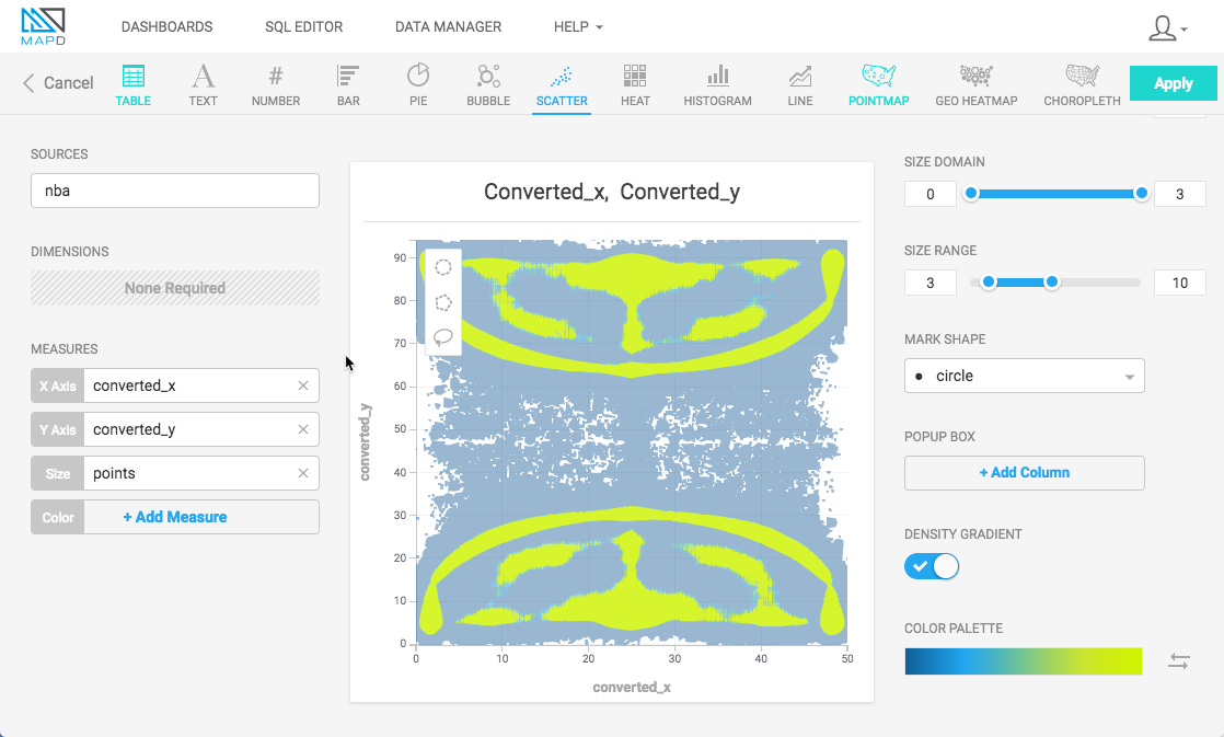
You can make the highest scoring points more obvious by assigning the points to the Size measure.
You can add a pop-up box to annotate the points on the chart. Under POPUP BOX, click + Add Column and choose points. Click + Add Column again, and choose shot_distance.
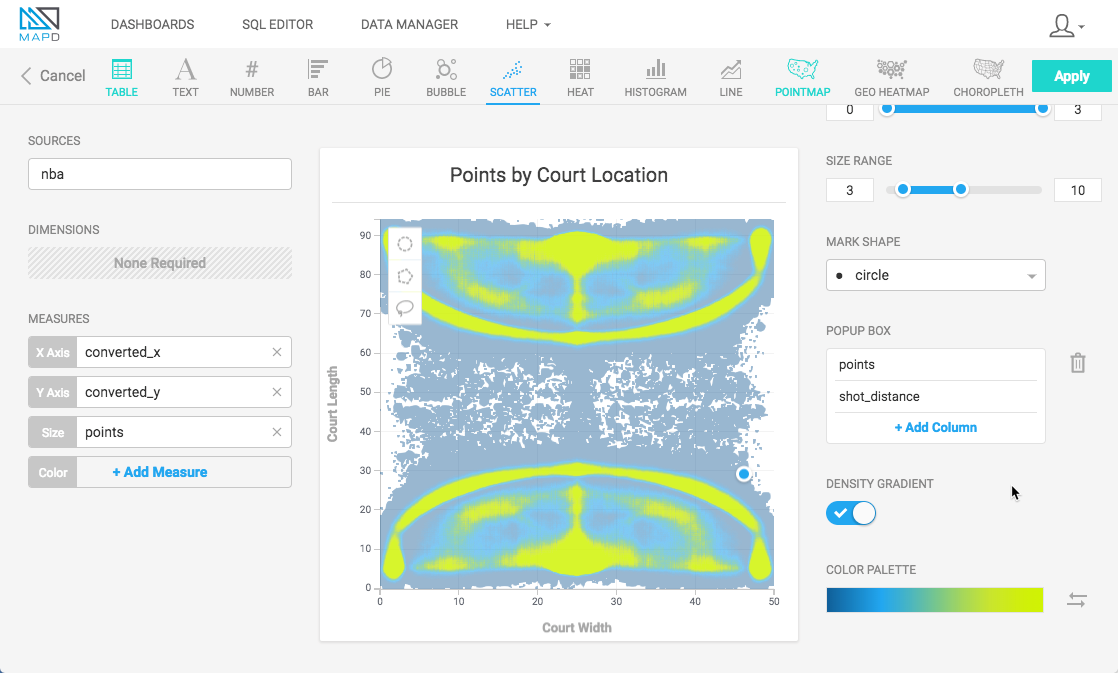
You can make the chart communicate more effectively at a glance by changing the color palette to green-to-red and reversing the order. This shows the lowest scoring points in red, highest scoring points in green.
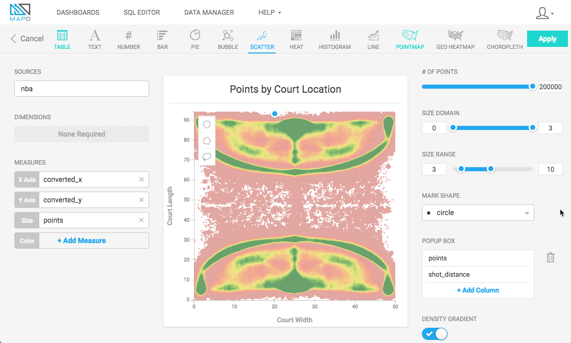
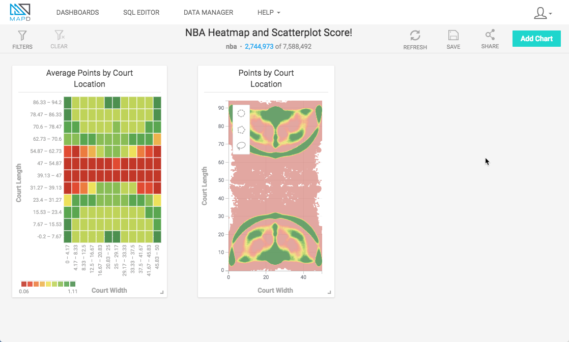
The final chart is similar to the Heatmap chart of the same data, but provides much more detail and precision for analysis of the highest scoring locations on the basketball court.
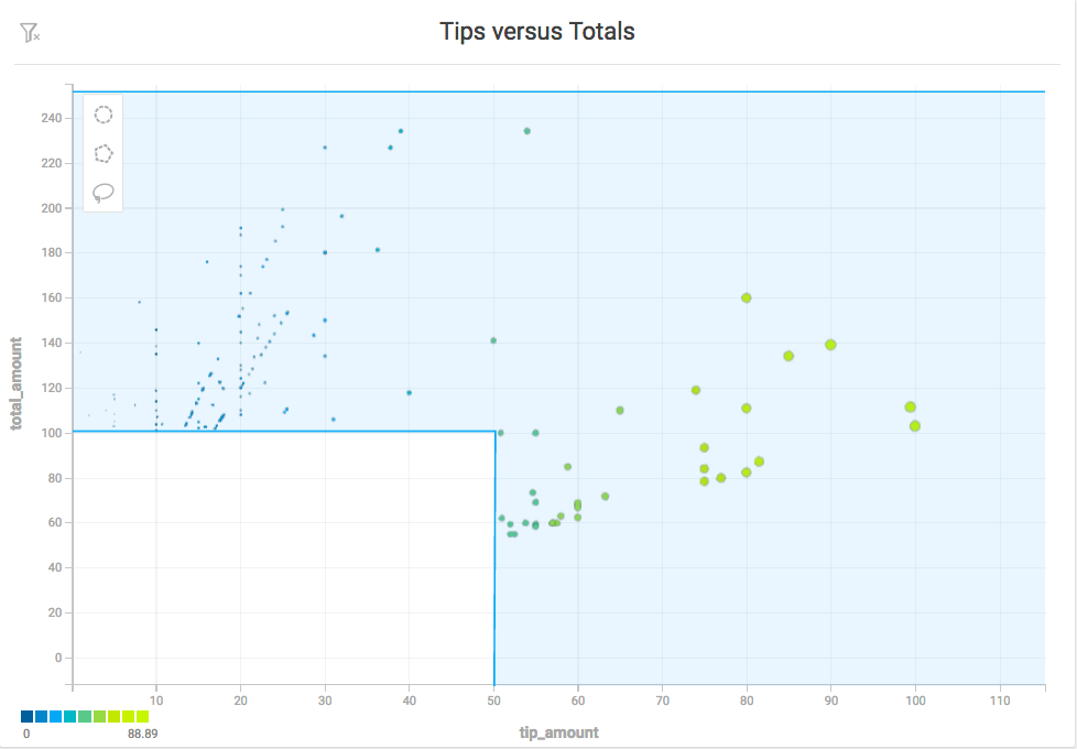
Zoom and Selection
You can zoom in on specific areas of a Scatter plot chart and select arbitrary sets of data points using the selection tools.
Zoom
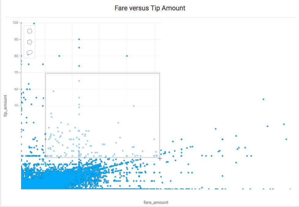
You can select and zoom a specific region of a Scatter plot chart. Hold the shift key, then drag a rectangular selection around the area on which you want to zoom. You can also zoom in and out using a mouse scrolling button.
Selection
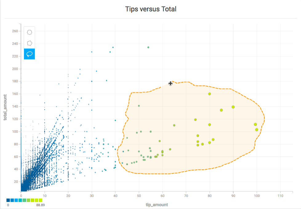
You can select a subset of the points in a Scatter plot using the Circle, Polygon, and Lasso selection tools.
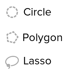
Circle Selector
Use the Circle tool to select an area around a specific central point. Click the Circle tool icon, then click anywhere on the map to create a circular selection.
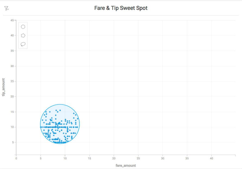
To move the circle, click anywhere inside the selected area to select the circle. Drag the circle to the new location.
To resize the circle, click anywhere inside the selected area, then drag any of the white squares to scale the circle up or down. Drag the white squares at the midpoints to scale in only one direction. Hold the Shift key to maintain the relative proportions of the selection. Hold the Alt key to scale the selection from the center outward.
Polygon Selector
Use the Polygon tool to select an area with noncomplex angles. Click to set each point. As you draw the selection, you can hold the Shift key to contrain each line to 45° angle increments relative to the previous line.
To complete the selection, do one of the following:
- Double-click
- Click the starting point a second time
- Press Enter
To change the size of the selection, click anywhere in the selected region. Drag any of the white corner dots to resize the selection. Hold the Shift key to constrain the relative proportions of the selection. Hold the Alt key to scale the selection from the center.
To rotate the selection, mouse hover over any corner to display a curved arrow. Click and drag to rotate. Hold the Shift key to rotate in 45° increments.
To edit the endpoints in the selection, double-click anywhere in the region. Drag the white endpoints to new locations. To add an endpoint, click one of the small orange dots in the middle of a line segment; it becomes a new endpoint that you can drag to your desired position. To delete an endpoint, hold the Alt key and click the endpoint.
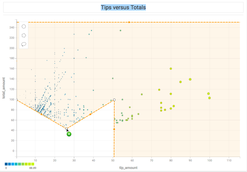
Note that if you create a selection where lines intersect the behavior is undefined and has unpredictable results.
Lasso Selector
Use the Lasso tool to trace around an area with curves or complex angles. Click to start, drag to draw the outline of your desired area, then release the mouse at any time to complete the selection with a straight line.
Once you have created your selection, the selection points are simplified, and you can edit or update the selection as you would a selection made with the Polygon tool.