Using Filters
Immerse lets you narrow the data in your visualizations by clicking areas of the chart on which you want to filter.
Using Filter Sets
You can reduce the scope of information to gain specific insights in your chart by filtering out values not pertinent to the analysis you are performing. You can create and name reusable filter sets in the Filter Panel.
To create a new filter set, click the (+) symbol next to Filter Sets. A numbered circle indicates the active filter set. Click the numbered circles to switch between the defined filter sets. Click the (-) symbol to delete the active filter set. Toggle off permanently turns off the settings in the current filter set. Remove all removes all of the filters in the current set. Click the name of the filter set to edit the filter's name.
Open the Filter panel by clicking the Filter button. The Filter panel allows you to create logical filters based on actual values available in your current data set.
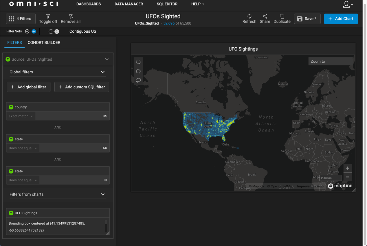
For example, the following set of steps creates a filter on a point map that restricts the selected records in the UFO Sightings data set to the contiguous United States.
- Click Filter Sets {+)
- Click + Add global filter.
- In the Data Selector, choose country.
- In the criterion field, choose Exact match and enter US as the value.
- Click + Add global filter.
- In the Data Selector, choose state.
- In the criterion field, choose Does not equal and enter AK as the value.
- Click + Add global filter.
- In the Data Selector, choose state.
- In the criterion field, choose Does not equal and enter HI as the value.
- Set the Name of the filter set to Contiguous US
The map displays UFO sightings only in the contiguous US. You can switch back to the default filter (circle 1) to see all UFO sightings, then click the numbered circle 2 to filter to the contiguous US again.
Brushing
For line and histogram charts, filter by dragging left or right along the chart to select a range (brushing). The chart results are filtered to reflect only the highlighted range.
Filtering Pointmap and Scatter Plot Charts
For point map and scatter plots, filter by zooming in on regions. Hold the shift key to select a rectangular area of the map and zoom in. You can also use the mouse wheel or trackpad to zoom in and out.
Using Zoom Tools
You can focus on arbitrary sets of points in your pointmap or scatter plot using the selection tools. See Zoom and Select.
Using Zoom To
Pointmaps also provide a Zoom To field, where you can zoom to a particular geographic location by name. You can enter a country, a city, or something as specific as a street address.
For other charts, click the section of the chart on which you want to focus.
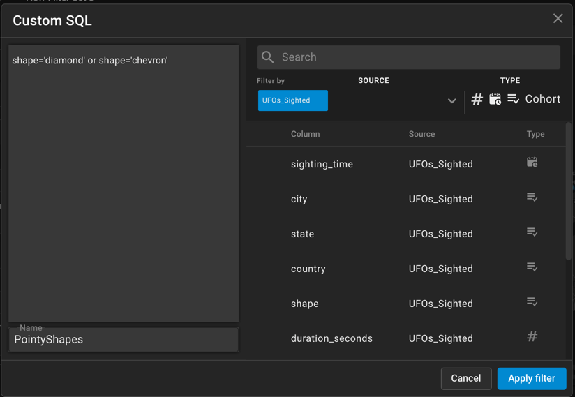
Creating a Custom SQL Filter
You can create a custom SQL filter for fine-grained analysis of your data. The SQL filter is essentially the WHERE clause of a SQL statement.
For example, you might want to filter for UFOs that are either diamond-shaped or chevron-shaped.
- Click Filter Sets + to create a new filter set.
- Click + Add custom SQL filter.
- In the editor, type
shape='diamond' or shape='chevron'. - Enter PointyShapes in the Name field.
- Click Apply Filter.
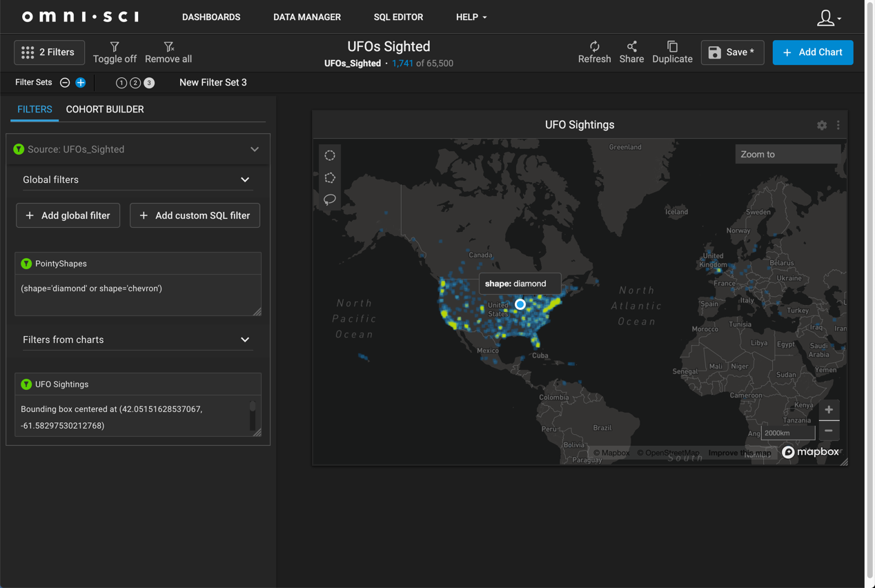
The data set is now filtered to only display sightings of UFOs that are either diamond-shaped or chevron-shaped.
Inverse Filters
You can also choose to filter out certain data. Click the chart element you you want to suppress while holding down the Command key (Macintosh) or Control key (Windows/Linux). This feature is available for all chart types other than line, histogram, pointmap, and number.
Using Cross Filters
At the dashboard level, when you filter results in one chart, the filter is reflected in any other chart on the dashboard that uses the same data table. For example, if you filter the state of Florida in a point map, all other charts on the dashboard adjust their results to only reflect records from the state of Florida.
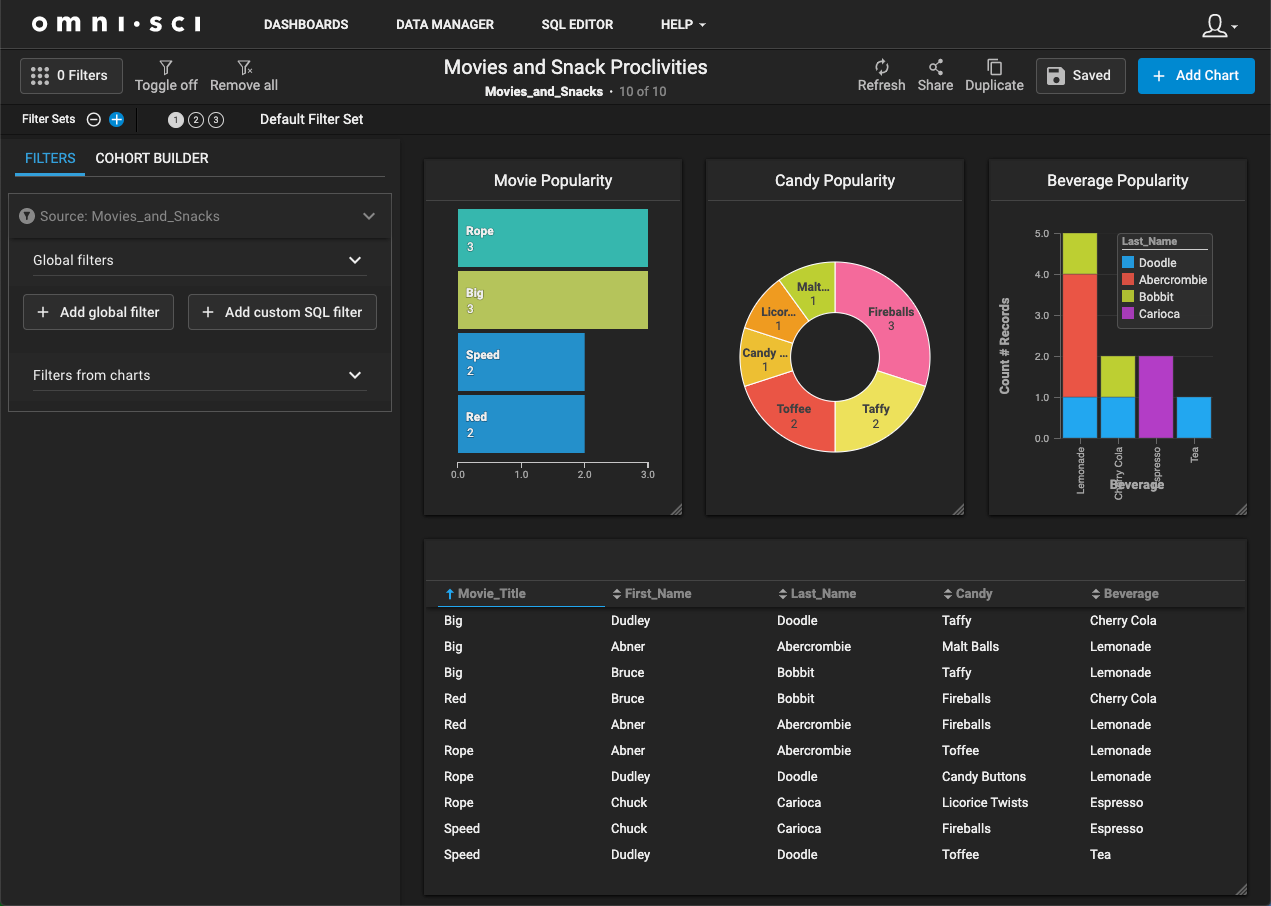
Using Cohorts
Filters reduce the number of records displayed. Cohorts are named result sets of filtered data. Once you have named the cohort, you can work with those rows of data independently of the filters that created them, performing queries that span all rows in the data set.
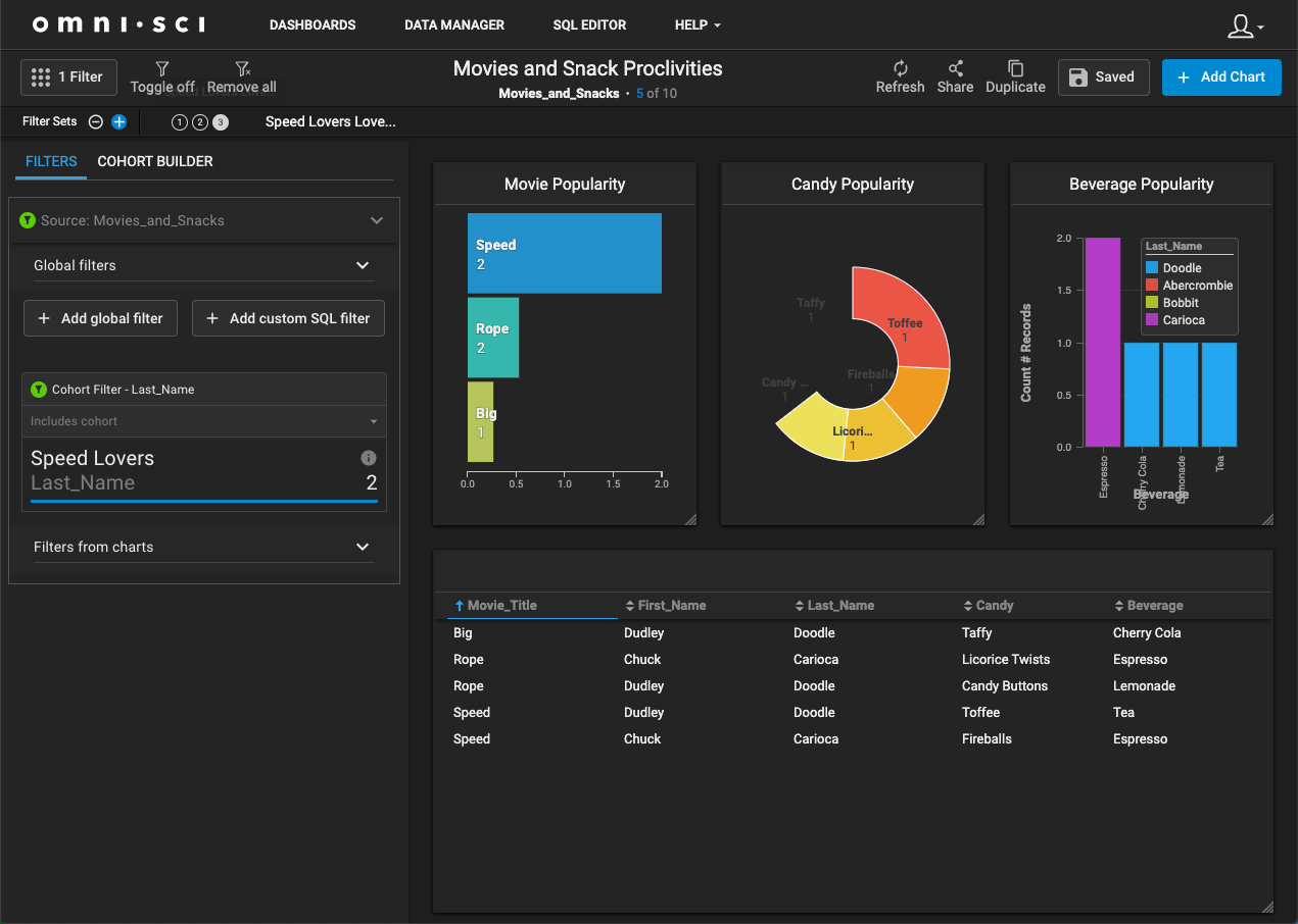
For example, here is a dashboard depicting a very small (10-row) data set of 4 people who went to see 1 or more of 4 movies.
In the Cohort Builder, you can filter the results to focus on only the people who went to see the movie Speed. You can name the filtered result set Speed Lovers.
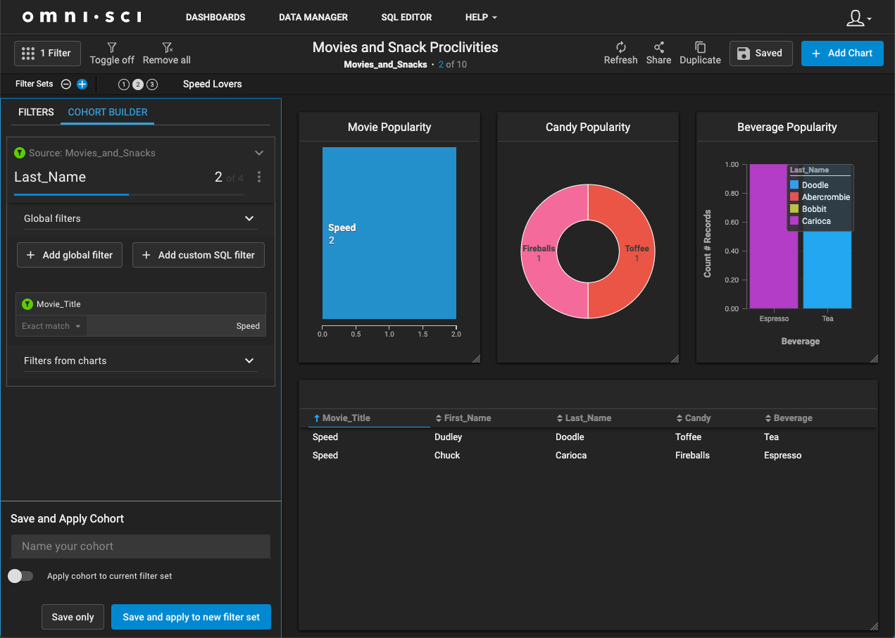
Since you filtered on the movie field, you normally would not be able to make a broader query to find out what other movies the 2 people who went to see Speed also went to see. But the cohort is now independent of its selection criteria. If you create a new filter using the cohort as a criterion, you can display records for all of the other movies seen by the fans of Speed.