Tutorial: Using Transforms Aggregation
You can create Vega-based visualizations with render properties that are driven by aggregated statistics. You can use Vega transform aggregation and formula expressions to automate the process of gathering statistical information about a rendered query. By doing so, you do not have to run an SQL prequery to get the information, thereby reducing the time it takes to process and render a chart.
The following examples show how to use transforms in Vega to do the following:
- Render a heatmap that is colored using dynamic statistics of the bins
- Create a geo pointmap with different transform modes
NOTE: You can see Vega examples in the OmniSci Vega Editor. For more information about the OmniSci Vega engine, see Try Vega.
Rendering a Heatmap Colored by Bin Statistics
The following heatmap example demonstrates the benefits of Vega transforms for performance and reducing redundancy:
- First, the example shows using an SQL expression to render a heatmap, as well as an additional expression to color the hexagonal bins according to the
minandmaxof thecntvalue of the aggregated bins from the query. - Then, you will see how to render the heatmap and color the bins directly in Vega by using
sourcedata definitions and performing aggregation transforms on that data, decreasing chart rendering time and redundancy.
SQL Queries
The following is a typical SQL query used for rendering a hexagonal heatmap:
SELECT
        reg_hex_horiz_pixel_bin_x(conv_4326_900913_x(lon),conv_4326_900913_x(-157),conv_4326_900913_x(157),conv_4326_900913_y(lat),conv_4326_900913_y(-63),conv_4326_900913_y(81),9.9667,11.5085,0,0,897,647) as x,
        reg_hex_horiz_pixel_bin_y(conv_4326_900913_x(lon),conv_4326_900913_x(-157),conv_4326_900913_x(157),conv_4326_900913_y(lat),conv_4326_900913_y(-63),conv_4326_900913_y(81),9.9667,11.5085,0,0,897,647) as y,
        count(*) as cnt
FROM tweets_nov_feb
WHERE ((lon >= -157 AND lon <= 157) AND (lat >= -63 AND lat <= 81))
GROUP BY x, y;
To color the hexagonal bins according to the min and max of the cnt value of the bins from the query, you need to run a prequery to gather these statistics manually. Here, this is done using a subquery SQL statement:
    SELECT
             min(cnt), max(cnt)
    FROM (SELECT
       reg_hex_horiz_pixel_bin_x(conv_4326_900913_x(lon),conv_4326_900913_x(-157),conv_4326_900913_x(157),conv_4326_900913_y(lat),conv_4326_900913_y(-63),conv_4326_900913_y(81),9.9667,11.5085,0,0,897,647) as x,
       reg_hex_horiz_pixel_bin_y(conv_4326_900913_x(lon),conv_4326_900913_x(-157),conv_4326_900913_x(157),conv_4326_900913_y(lat),conv_4326_900913_y(-63),conv_4326_900913_y(81),9.9667,11.5085,0,0,897,647) as y,
       count(*) as cnt
FROM tweets_nov_feb
WHERE ((lon >= -157 AND lon <= 157) AND (lat >= -63 AND lat <= 81))
GROUP BY x, y
    );
The values returned from this query can then be embedded in the Vega code to color the heatmap bins. Notice that the second query does an aggregation over the query, effectively running the query twice.
To avoid the redundancy and expense of running the query twice, you can instead specify the aggregation in Vega.
Render the Heatmap in Vega
The following Vega code renders the heatmap colored by aggregated statistics using transforms.
{
  "width": 897,
  "height": 647,
  "data": [
        {
          "name": "heatmap_query",
          "sql": "SELECT reg_hex_horiz_pixel_bin_x(conv_4326_900913_x(lon),conv_4326_900913_x(-157),conv_4326_900913_x(157),conv_4326_900913_y(lat),conv_4326_900913_y(-63),conv_4326_900913_y(81),9.9667,11.5085,0,0,897,647) as x, reg_hex_horiz_pixel_bin_y(conv_4326_900913_x(lon),conv_4326_900913_x(-157),conv_4326_900913_x(157),conv_4326_900913_y(lat),conv_4326_900913_y(-63),conv_4326_900913_y(81),9.9667,11.5085,0,0,897,647) as y, count(*) as cnt FROM tweets_nov_feb WHERE ((lon >= -157 AND lon <= 157) AND (lat >= -63 AND lat <= 81)) GROUP BY x, y"
        },
        {
          "name": "heatmap_stats",
          "source": "heatmap_query",
          "transform": [
                {
                  "type": "aggregate",
                  "fields": ["cnt", "cnt"],
                  "ops":    ["min", "max"],
                  "as":     ["mincnt", "maxcnt"]
                }
          ]
        }
  ],
  "scales": [
        {
          "name": "heat_color",
          "type": "quantize",
          "domain": {"data": "heatmap_stats", "fields": ["mincnt", "maxcnt"]},
          "range": ["#115f9a", "#1984c5", "#22a7f0", "#48b5c4", "#76c68f",
                                "#a6d75b", "#c9e52f", "#d0ee11", "#d0f400"
          ]
        }
  ],
  "marks": [
        {
          "type": "symbol",
          "from": {
                "data": "heatmap_query"
          },
          "properties": {
                "shape": "hexagon-horiz",
                "xc": {
                  "field": "x"
                },
                "yc": {
                  "field": "y"
                },
                "width": 9.9667,
                "height": 11.5085,
                "fillColor": {
                  "scale": "heat_color",
                  "field": "cnt"
                }
          }
        }
  ]
}
The data section named heatmap_stats has a source data table defined by the "source": "heatmap_query" line:
"name": "heatmap_stats",
"source": "heatmap_query",
The "heatmap_stats" data takes as input the "heatmap_query" data, which is the data supplied by the SQL query. Use the source data type to apply intermediary steps or expressions (transforms) to the input source data.
For information about syntax and requirements for the source and transform properties, see the Data property.
To color the data according to the range of values defined by two standard deviations from the mean, edit the "heatmap_stats" section as follows to:
- Aggregate the minimum, maximum, average, and sampled standard deviation of the count column.
- Use formula expressions to calculate values that are two standard deviations from the average.
{
   "name": "heatmap_stats",
   "source": "heatmap_query",
   "transform": [
     {
       "type": "aggregate",
       "fields": ["cnt", "cnt", "cnt", "cnt"],
       "ops":    ["min", "max", "avg", "stddev"],
       "as":     ["mincnt", "maxcnt", "avgcnt", "stdcnt"]
     },
     {
       "type": "formula",
       "expr": "max(mincnt, avgcnt-2*stdcnt)",
       "as": "mincnttouse"
     },
     {
       "type": "formula",
       "expr": "min(maxcnt, avgcnt+2*stdcnt)",
       "as": "maxcnttouse"
     }
   ]
 }
Then, reference these values in the scale domain:
{
   "name": "heat_color",
   "type": "quantize",
   "domain": {"data": "heatmap_stats", "fields": ["mincnttouse", "maxcnttouse"]},
   "range": ["#115f9a", "#1984c5", "#22a7f0", "#48b5c4", "#76c68f",
             "#a6d75b", "#c9e52f", "#d0ee11", "#d0f400"
   ]
 }
Performing these calculations in Vega improves performance because the SQL query is only run once and the aggregated statistics are done “on the fly.” Because the query is not repeated in a statistical prequery step, you can reduce the full render time by half by performing the statistics step in Vega at render time.
Creating a Geo Pointmap Using Transforms to Drive Color and Size
This section shows how to use Vega tranforms to drive the color and size of points in a geo pointmap. Specifically, it show examples using the following aggregation transforms:
distinct: An array of distinct values from an input data column.median: The median of an input data column.quantile: An array of quantile separators; operates on numeric columns and takes the following pameters:numQuantiles: The number of contiguous intervals to create; returns the separators for the intervals. The number of separators equalsnumQuantiles - 1.includeExtrema: Whether to include min and max values (extrema) in the resulting separator array. The size of the resulting separator array will benumQuantiles+ 1.
As with the heatmap example described earlier, using Vega transforms eliminate the need for an SQL prequery and significantly improves performance for dynamic operations.
The examples that follow use a Twitter dataset to create a geo pointmap.
For more information about the aggregate functions used in these examples, see transforms in the Vega Data reference.
Distinct
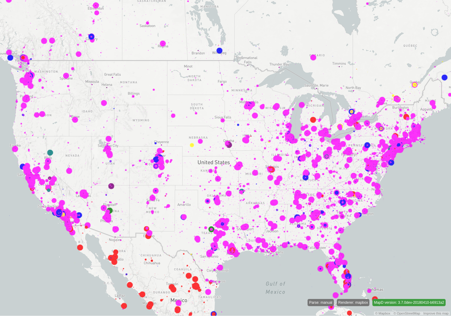
In the following example, the size of the points in a geo pointmap are defined by the numeric range two standard deviations from the average number of followers of the input data. The color of the points is driven by the distinct languages of the input data. To calculate the distinct languages, you could run a prequery using DISTINCT and then populate a Vega color scale with the results. However, the query would need to be run before every render update if the distinct data is meant to be dynamic, which would be very costly.
With the distinct Vega transform, this can be performed when evaluating the Vega code in the backend, so you do not need to run the prequery. This can improve performance considerably.
{
  "width": $width,
  "height": $height,
  "data": [
    {
      "name": "table",
      "sql": "SELECT conv_4326_900913_x(lon) as x,conv_4326_900913_y(lat) as y,followers,lang,rowid FROM tweets_2017_may WHERE (lon between $minLon and $maxLon AND lat between $minLat and $maxLat) LIMIT 200000"
    },
    {
      "name": "xformtable",
      "source": "table",
      "transform": [
        {
          "type": "aggregate",
          "fields": ["followers", "followers", "followers", "followers", "lang"],
          "ops":    ["min", "max", "avg", "stddev", "distinct"],
          "as":     ["minfol", "maxfol", "avgfol", "stdfol", "distinctlang"]
        },
        {
          "type": "formula",
          "expr": "max(minfol, avgfol-2*stdfol)",
          "as": "minfoltouse"
        },
        {
          "type": "formula",
          "expr": "min(maxfol, avgfol+2*stdfol)",
          "as": "maxfoltouse"
        }
      ]
    }
  ],
  "scales": [
    {
      "name": "x",
      "type": "linear",
      "domain": [
        $minXBounds,
        $maxXBounds
      ],
      "range": "width"
    },
    {
      "name": "y",
      "type": "linear",
      "domain": [
        $minYBounds,
        $maxYBounds
      ],
      "range": "height"
    },
    {
      "name": "size",
      "type": "linear",
      "domain": {"data": "xformtable", "fields": ["minfoltouse", "maxfoltouse"]},
      "range": [
        1, 20
      ],
      "clamp": true
    },
    {
      "name": "color",
      "type": "ordinal",
      "domain": {"data": "xformtable", "field": "distinctlang"},
      "range": [
        "blue", "red", "green", "yellow", "magenta", "purple", "teal"
      ]
    }
  ],
  "marks": [
    {
      "type": "points",
      "from": {
        "data": "table"
      },
      "properties": {
        "x": {
          "scale": "x",
          "field": "x"
        },
        "y": {
          "scale": "y",
          "field": "y"
        },
        "fillColor": {
          "scale": "color",
          "field": "lang"
        },
        "size": {
          "scale": "size",
          "field": "followers"
        }
      }
    }
  ]
}
This Vega code results in this image:

Median
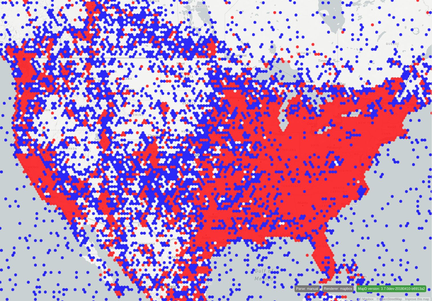
Outliers in a dataset can significantly skew statistics such as AVG and STDDEV. To mitigate this, you can use median and quantile to create a more meaningful probability distribution of the data. Median and quantiles are computed dynamically when Vega is evaluated and can be used to drive different render properties.
The following hexmap example uses median to drive the color of the hex bins. Notice in the final render that roughly half of the bins are colored red, and the other half are blue.
{
  "width": $width,
  "height": $height,
  "data": [
    {
      "name": "heatmap_query",
      "sql": "SELECT reg_hex_horiz_pixel_bin_x(conv_4326_900913_x(lon),$minXBounds,$maxXBounds,conv_4326_900913_y(lat),$minYBounds,
	  $maxYBounds,9.931506849315069,11.467916305821335,0,0,$width,$height) as x,reg_hex_horiz_pixel_bin_y(conv_4326_900913_x(lon),$minXBounds,$maxXBounds,
	  conv_4326_900913_y(lat),$minYBounds,$maxYBounds,9.931506849315069,11.467916305821335,0,0,$width,$height) as y, count(*) as color FROM tweets_2017_may
	  WHERE ((lon >= $minLon AND lon <= $maxLon) AND (lat >= $minLat AND lat <= $maxLat)) GROUP BY x, y"
    },
    {
      "name": "heatmap_statistics",
      "source": "heatmap_query",
      "transform": [
        {
          "type": "aggregate",
          "fields": ["color"],
          "ops":    ["median"],
          "as":     ["mediancolor"]
        }
      ]
    }
  ],
  "scales": [
    {
      "name": "heat_color",
      "type": "threshold",
      "domain": {"data": "heatmap_statistics", "field": "mediancolor"},
      "range": [
        "blue", "red"
      ]
    }
  ],
  "marks": [
    {
      "type": "symbol",
      "from": {
        "data": "heatmap_query"
      },
      "properties": {
        "shape": "hexagon-horiz",
        "xc": {
          "field": "x"
        },
        "yc": {
          "field": "y"
        },
        "width": 9.931506849315069,
        "height": 11.467916305821335,
        "fillColor": {
          "scale": "heat_color",
          "field": "color"
        }
      }
    }
  ]
}

Quantile
The quantile function takes two additional parameters:
numQuantilesis the number of contiguous intervals to create and returns the separators for the intervals. The number of returned separators isnumQuantiles- 1.includeExtremais atrueorfalsevalue indicating whether to include the extrema (min and max) in the resulting separator array. Iftrue, the number of returned values isnumQuantiles+ 1.
To see how a quantile works, consider a query that results in this set of values for "followers":
{3, 6, 7, 8, 8, 10, 13, 15, 16, 20}
With a quantile operator defined as {"type": "quantile", "numQuantiles": 4}, the result of the operator would be the following array:
[7, 9, 15]
25% of the data has less than 7 followers, 25% has between 7 and 9, 25% has between 9 and 15, and 25% has more than 15.
With a quantile operator defined as {"type": "quantile", "numQuantiles": 4, "includeExtrema": true}, the result of the operator would be the following array:
[3, 7, 9, 15, 20].
With "includeExtrema" == true, the min and max are included in the resulting array, so 25% of the data has between 3 and 7 followers, 25% has between 7 and 9, 25% has between 9 and 15, and 25% has between 15 and 20.
The following Vega code snippet gets the octiles (8-quantiles) and sextiles (6-quantiles) of a column called "followers":
...
{
 "name": "xformtable",
 "source": "table",
 "transform": [
   {
     "type": "aggregate",
     "fields": ["followers", "followers"],
     "ops":    [{"type": "quantile", "numQuantiles": 8}, {"type": "quantile", "numQuantiles": 6}],
     "as":     ["octile_fol", "sextile_fol"]
   }
 ]
}
...
For more information about quantiles, see: https://en.wikipedia.org/wiki/Quantile.
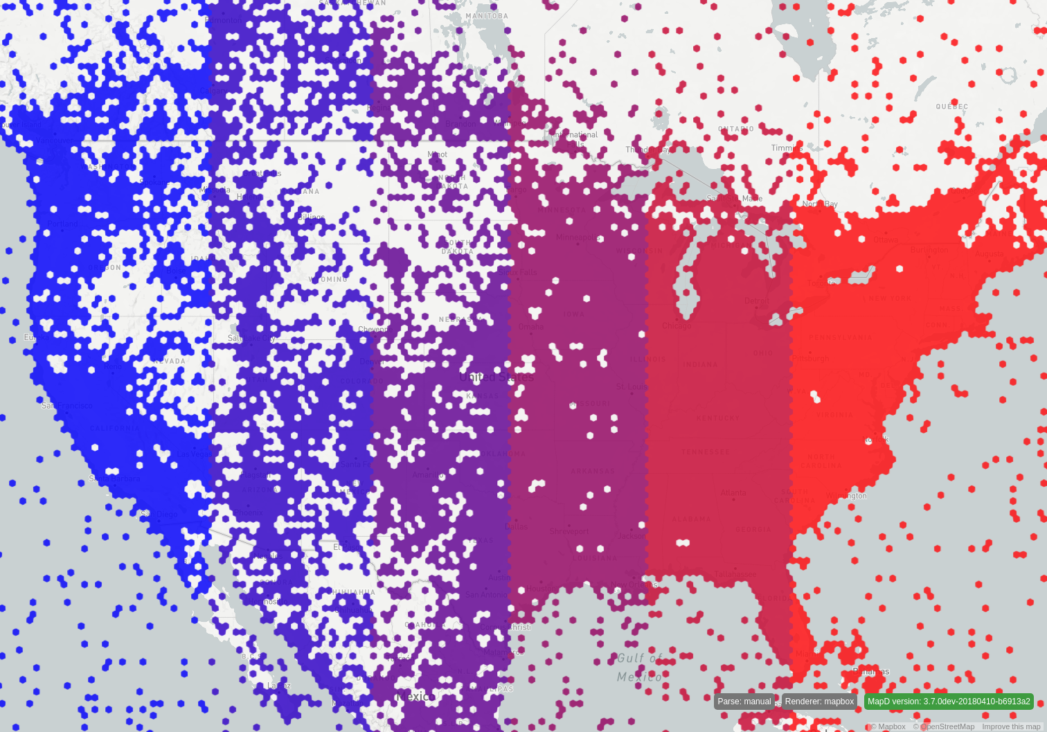
Here is a more complete example using sextiles. Notice in the resulting image approximately the same number of hexagons appears in each of the six quantile groups colored blue to red, from left to right.
{
  "width": $width,
  "height": $height,
  "data": [
    {
      "name": "heatmap_query",
      "sql": "SELECT reg_hex_horiz_pixel_bin_x(conv_4326_900913_x(lon),$minXBounds,$maxXBounds,conv_4326_900913_y(lat),
	  $minYBounds,$maxYBounds,9.931506849315069,11.467916305821335,0,0,$width,$height) as x,reg_hex_horiz_pixel_bin_y(conv_4326_900913_x(lon),
      $minXBounds,$maxXBounds,conv_4326_900913_y(lat),$minYBounds,$maxYBounds,9.931506849315069, 11.467916305821335,0,0,$width,$height) as y,
      count(*) as color FROM tweets_2017_may WHERE ((lon >= $minLon AND lon <= $maxLon) AND (lat >= $minLat AND lat <= $maxLat)) GROUP BY x, y"
    },
    {
      "name": "heatmap_statistics",
      "source": "heatmap_query",
      "transform": [
        {
          "type": "aggregate",
          "fields": ["x"],
          "ops":    [{"type": "quantile", "numQuantiles": 6}],
          "as":     ["sextilex"]
        }
      ]
    }
  ],
  "scales": [
     {
      "name": "heat_color",
      "type": "threshold",
      "domain": {"data": "heatmap_statistics", "field": "medianx"},
      "range": [
        "rgb(0, 0, 255)", "rgb(51, 0, 204)", "rgb(102, 0, 153)", "rgb(153, 0, 102)", "rgb(204, 0, 51)", "rgb(255, 0, 0)"
      ]
    }
  ],
  "marks": [
    {
      "type": "symbol",
      "from": {
        "data": "heatmap_query"
      },
      "properties": {
        "shape": "hexagon-horiz",
        "xc": {
          "field": "x"
        },
        "yc": {
          "field": "y"
        },
        "width": 9.931506849315069,
        "height": 11.467916305821335,
        "fillColor": {
          "scale": "heat_color",
          "field": "x"
        }
      }
    }
  ]
}

