Pie Chart
The Pie chart lets you compare the relative sizes of groups of data as segments of a circle.
| Features | Quantity | Notes |
|---|---|---|
| Required Dimensions | 1+ | Minimum 1, no limit, null dimensions optional. |
| Required Measures | 1-2 | Measure 1 = segment size, Measure 2 = segment color. |
Use a Pie chart to show the relative proportions of a small number categories. If you have many categories, or the values are very similar in size, a Bar chart is often a more effective way to compare the categories. Note also that you should not create Pie charts with a mix of positive and negative values.
Pie Chart Examples
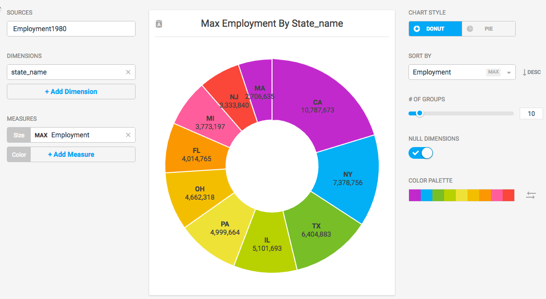
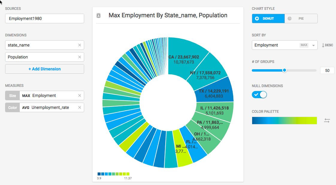
Create a new Pie chart. Choose a Data Source. This example graphs employment statistics for all 50 United States for the year 1980. The data is available at the University of Kentucky website.
Use the Dimension state_name and the Size measure Max Employment.
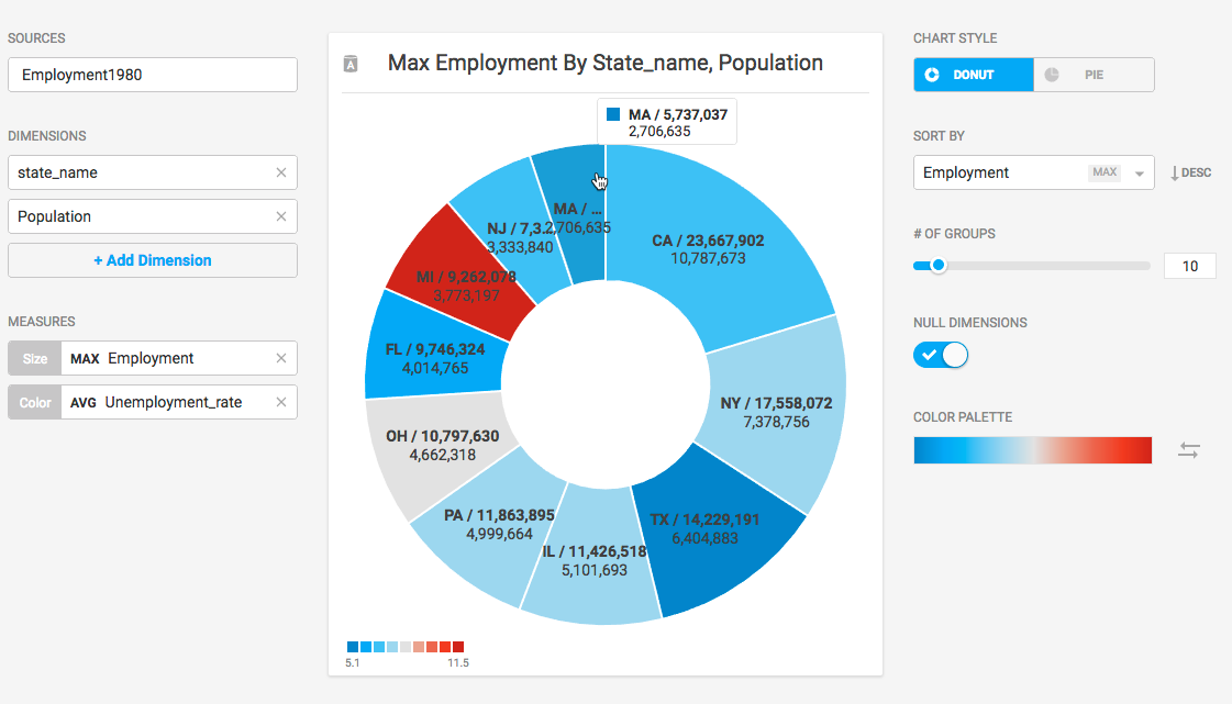
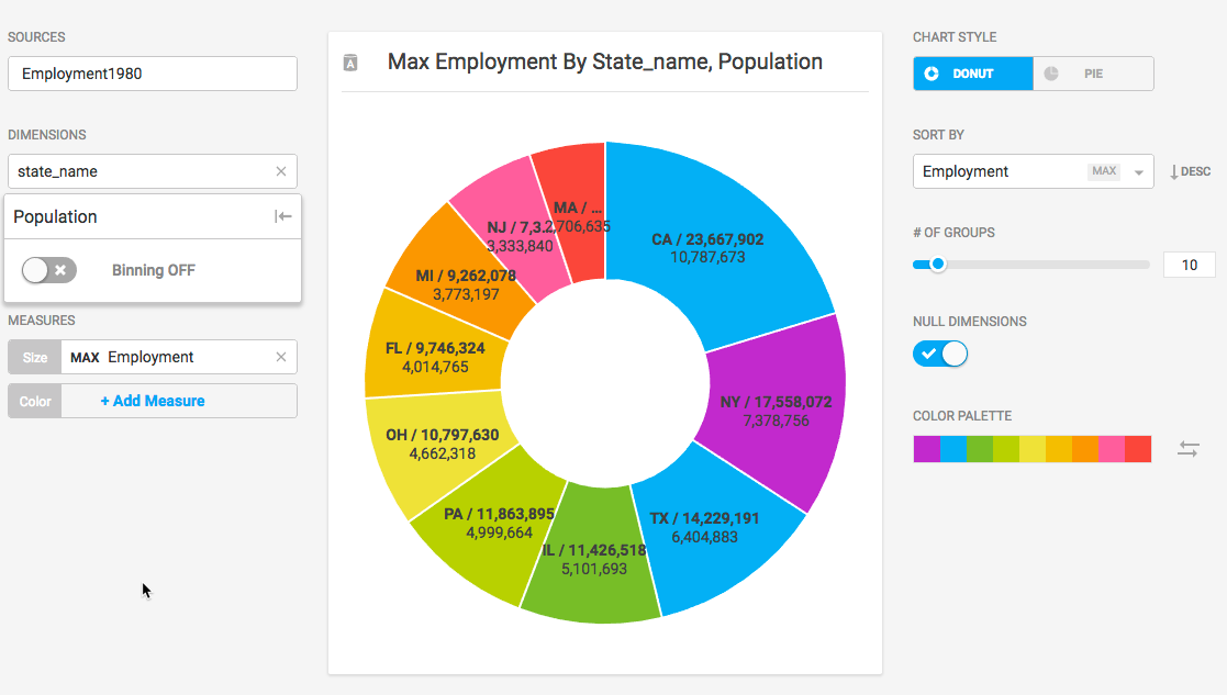
It might be interesting to add the state Population dimension to compare with the Employment figure. Set Binning off, so that only one state population is displayed with each segment.
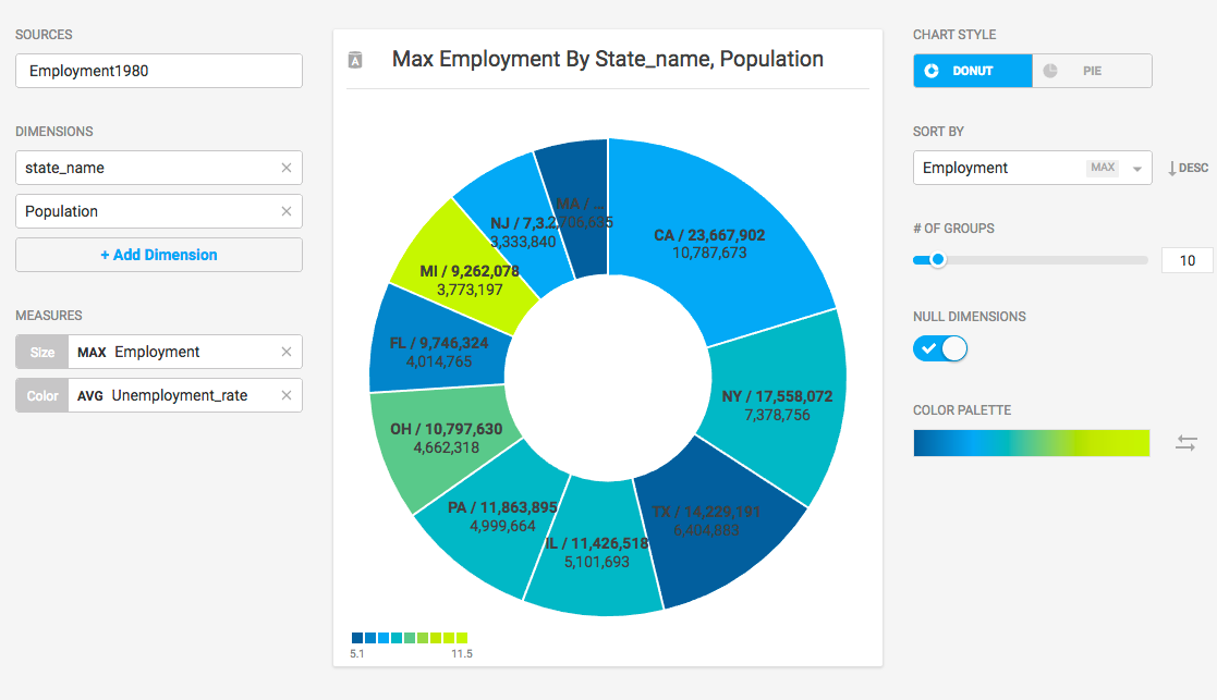
You can use the Color measure to reflect the Unemployment_rate, providing more nuanced understanding of the relative segments.
There are 50 states, so it might be tempting to show all 50 in the chart. The problem becomes obvious when there are too many segments with too little variation to provide meaningful analysis. 10 or fewer is probably a reasonable setting for # of Groups.
Changing the Color Palette might make an outlier such as Michigan stand out more effectively.
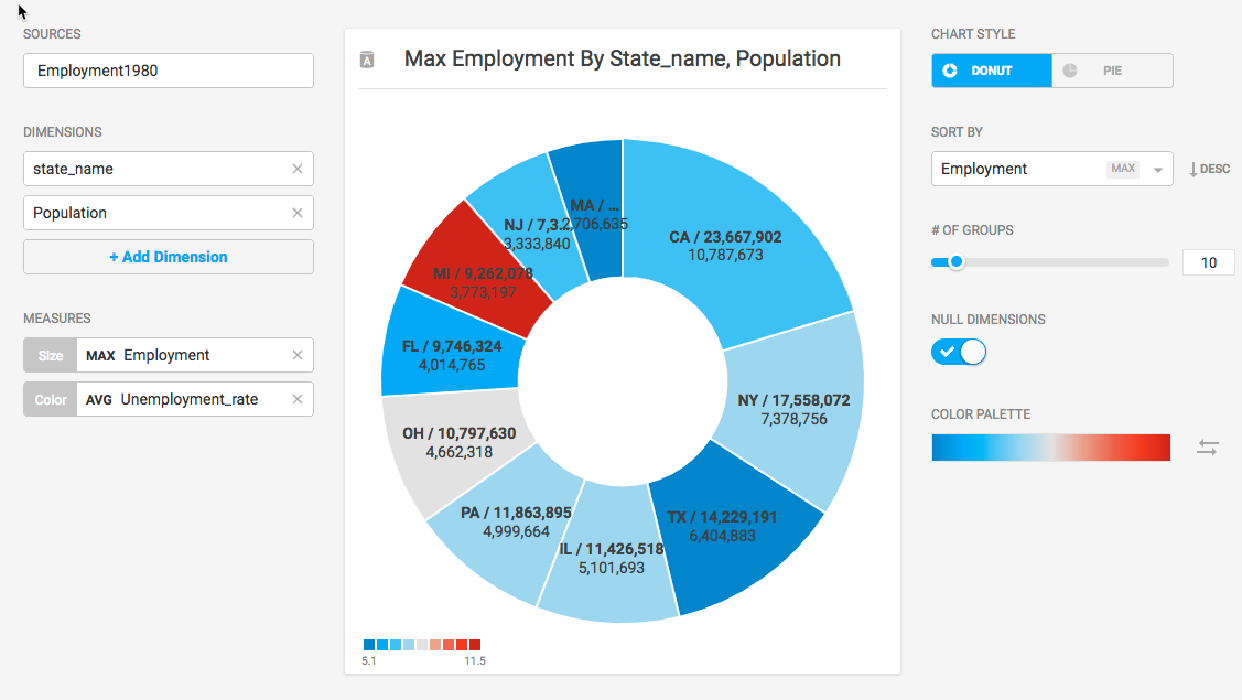
Where the segments do not have sufficient width to display the measures, you can mouse over to see a pop-up with the information for your chosen segment.