Line Chart
What it is
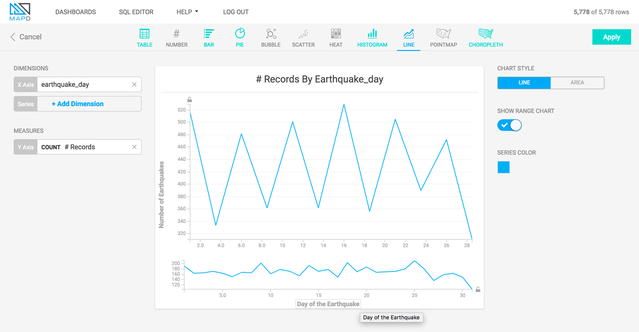
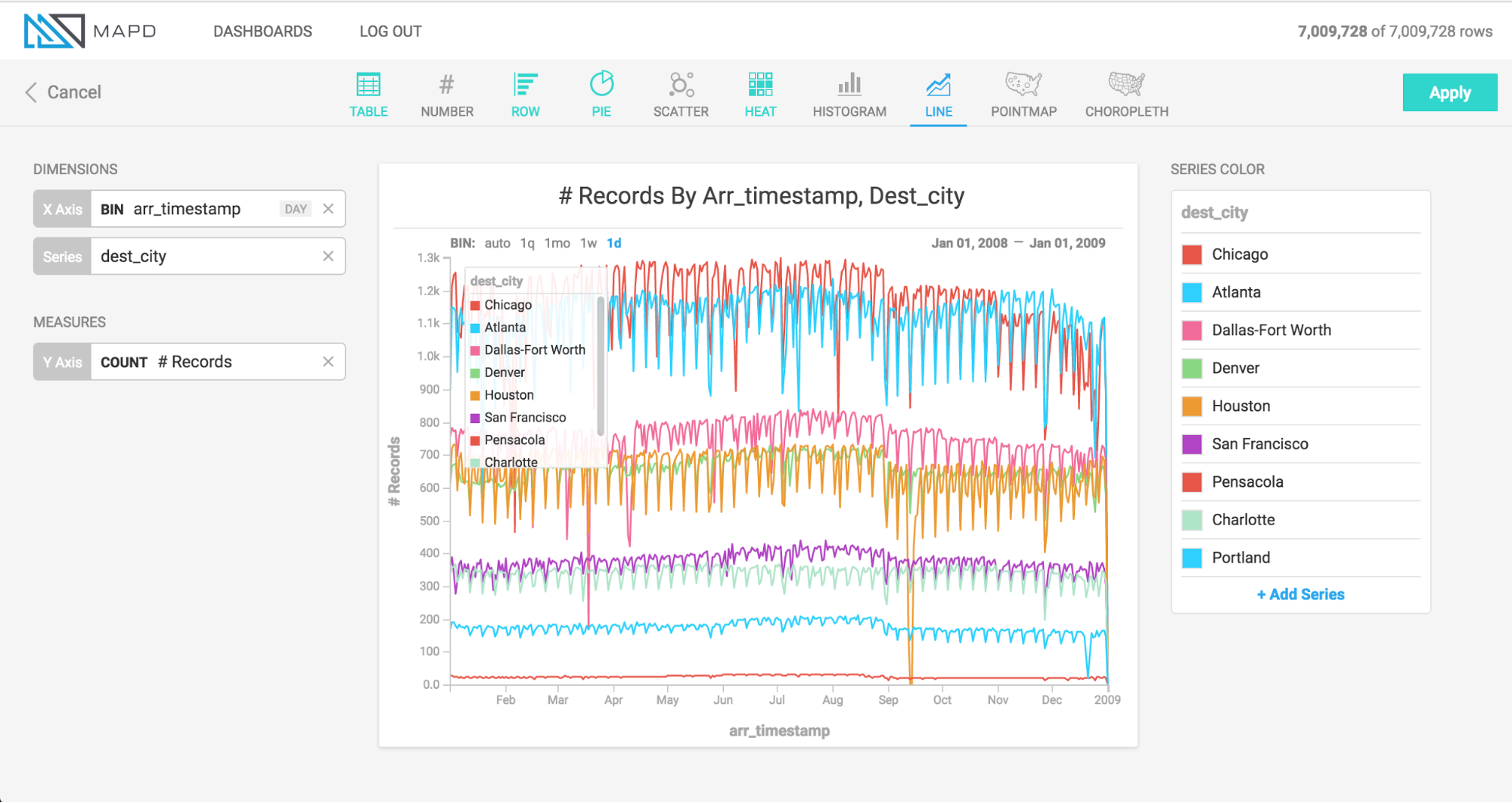
The Line chart represents a series of data as a line or multiple lines, plotted across time or another numerical dimension.
When to use it
Use a Line chart when you want to view how a measure changes over the course of time, or across the range of some other dimension. The optional multi-series capability of the Line chart is can break out values by an additional dimension; for example, as shown above, to compare the number of daily flights to several cities over time.
How to set it up
The animation below uses a political contributions dataset to create a histogram of average donation amount, broken out by contributor state and recipient state. During setup of the chart, the minimum and maximum of the color scale are tuned to give a clearer visualization.
Once you have chosen your measure and dimension, you can edit the labels for the X and Y axes. Click the label and enter your custom text.